Bittencourt · World Cup Watch Party · June 2027 · Coral Gables

Two ways to make the loudest day of the year

Both worlds are built from the same three colours and the same afternoon: sixty-four people, eight long tables on the lawn, and a match thrown onto the garage wall at five. They disagree about one thing — whether the design should say everything, or one thing.
Direction A
the world of the word

The Word Itself

The invitation is one word at architectural scale: the date ninety millimetres tall, knocked white out of a flood of colour, with nothing pictured anywhere. It answers the third thing you named — Brazilian modernism and the concrete poets — where the word is not a label stuck onto a picture, the word is the picture.

Mid-century modernist lettering standing in relief on a raw concrete wall in Rio, photographed square-on at midday with hard shadows, cropped so tightly that only two letterforms fill the frame.

Proof that a letter can be architecture — cropped this close the word stops being read and starts being a shape with a shadow of its own, and that is the size everything in this world is set at.
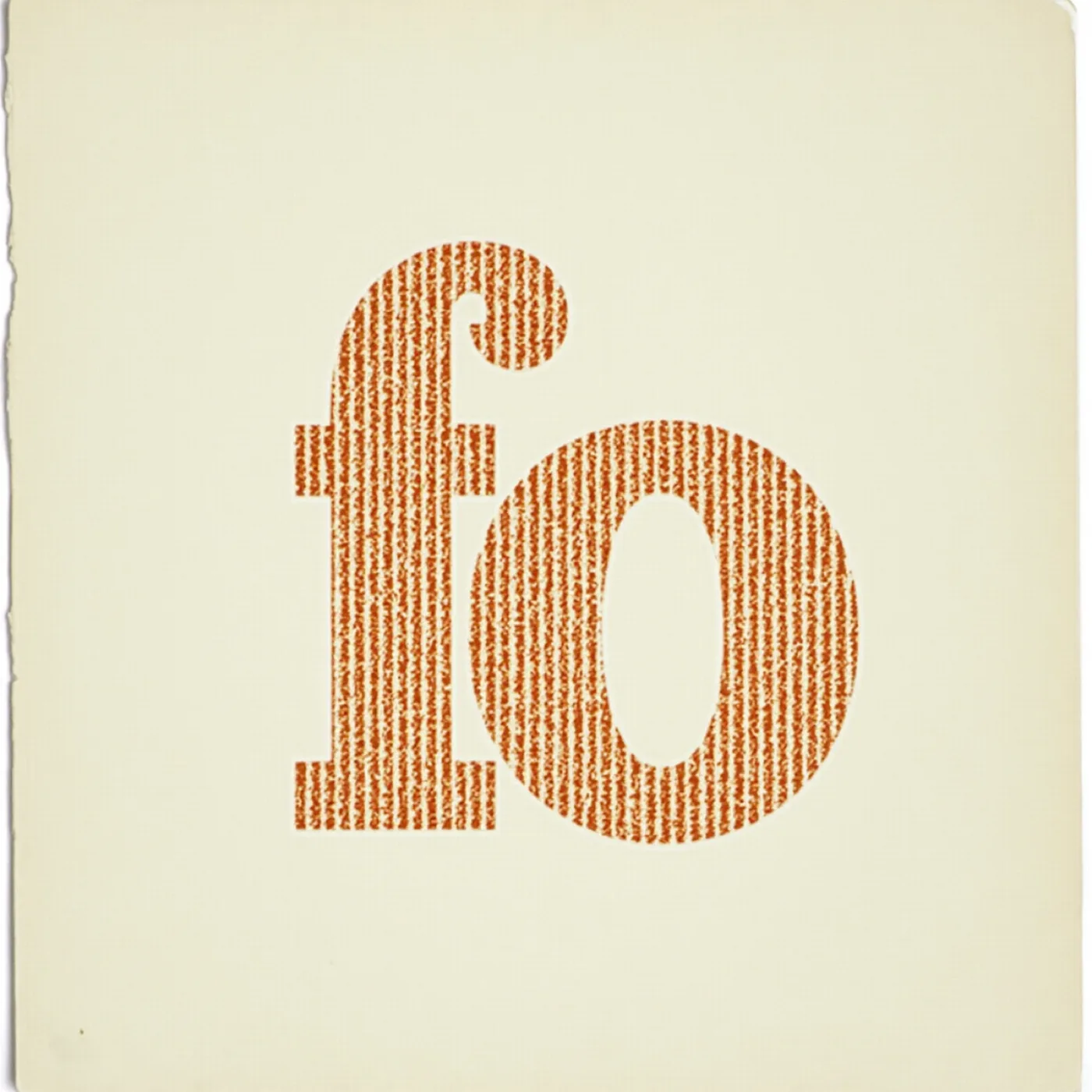
A letterpress proof on a deckled cream sheet: two large letterforms printed in flat orange, the ink biting unevenly into the paper

The tradition itself, on paper. Letterforms treated as shapes with weight and spacing rather than as a label for something else — which is the permission this direction runs on: a page can be entirely type and still be a picture.
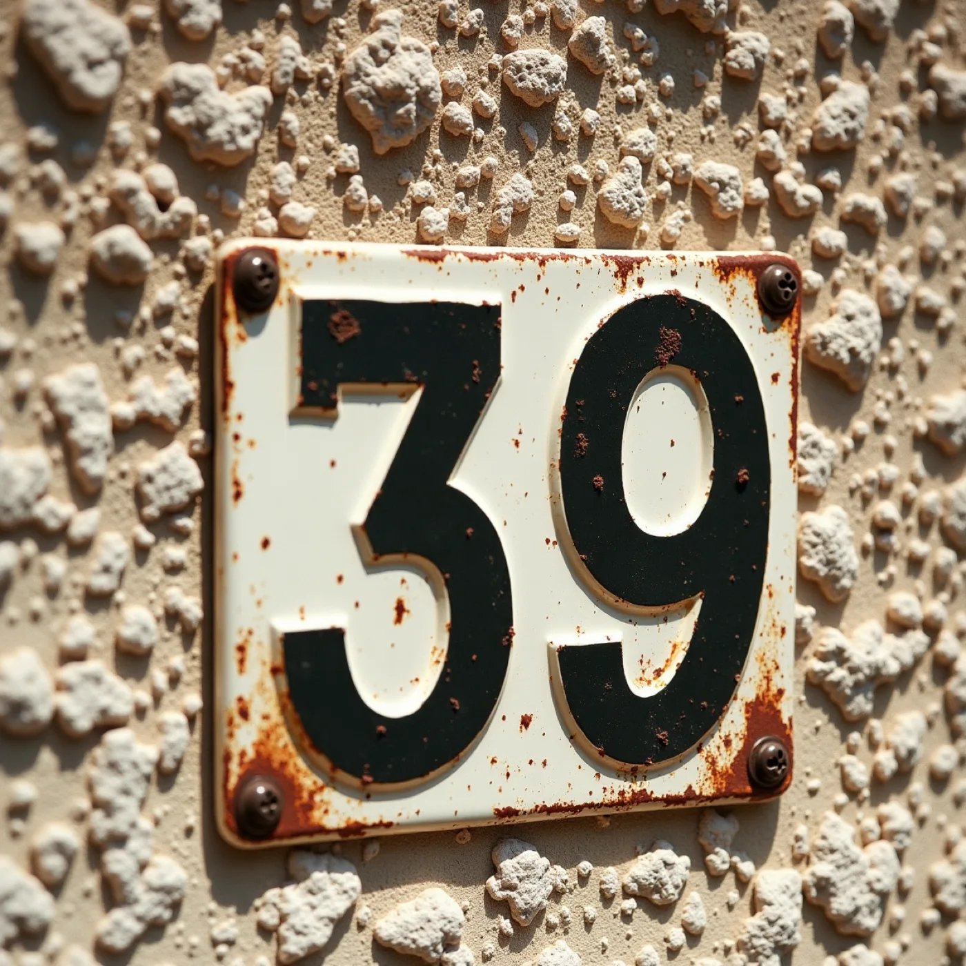
Weathered enamel house numbers fixed to coral rock and stucco in strong sun — digits only, chipped, with rust bleeding down from the screws.

Figures are the hardest part of this world, so the face gets chosen on its 4 and its 7 before anything else — a date set ninety millimetres tall and a field ruled for results both stand or fall on numerals that survive weather and distance.
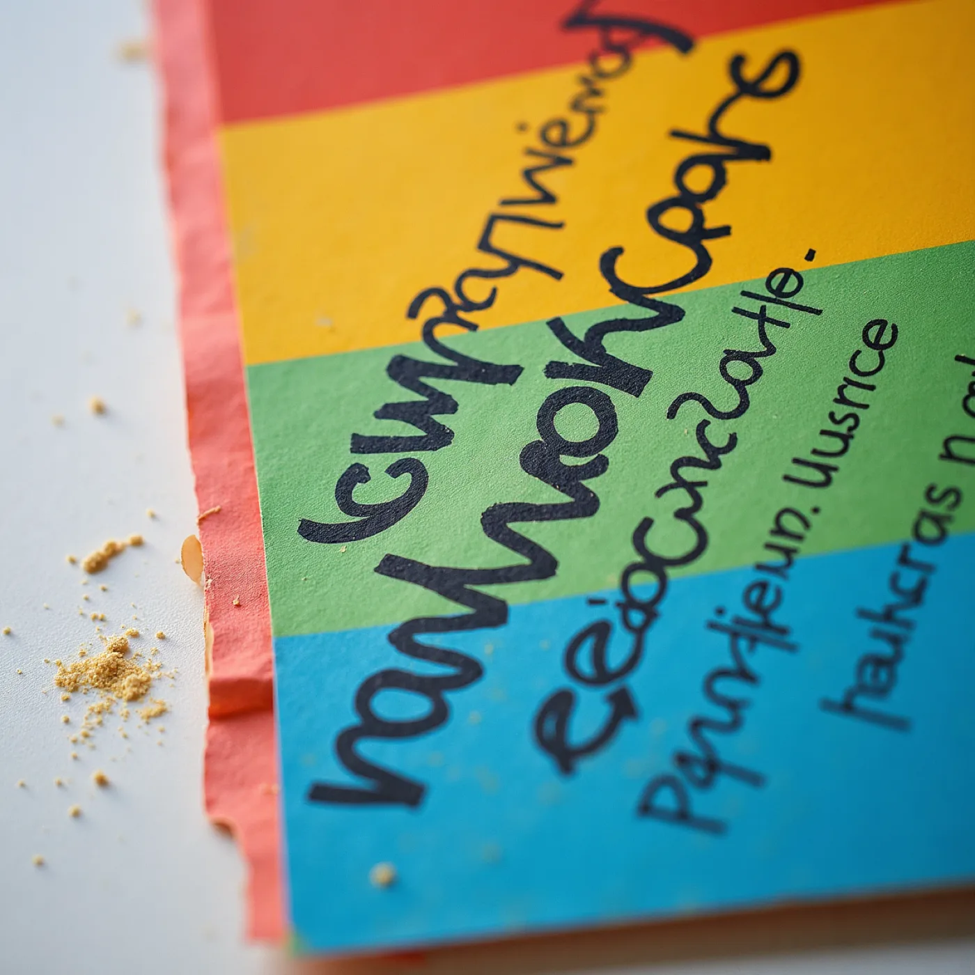
Ballpoint and marker scribbled hard across a flat printed field of saturated colour on cheap card, showing pressure, skipping ink and several different hands.

The argument for leaving one field printed empty — handwriting has to sit on top of flat ink without beading or skipping, which is a production question rather than a sentimental one, and it is why nothing in this suite is coated, varnished or foiled.
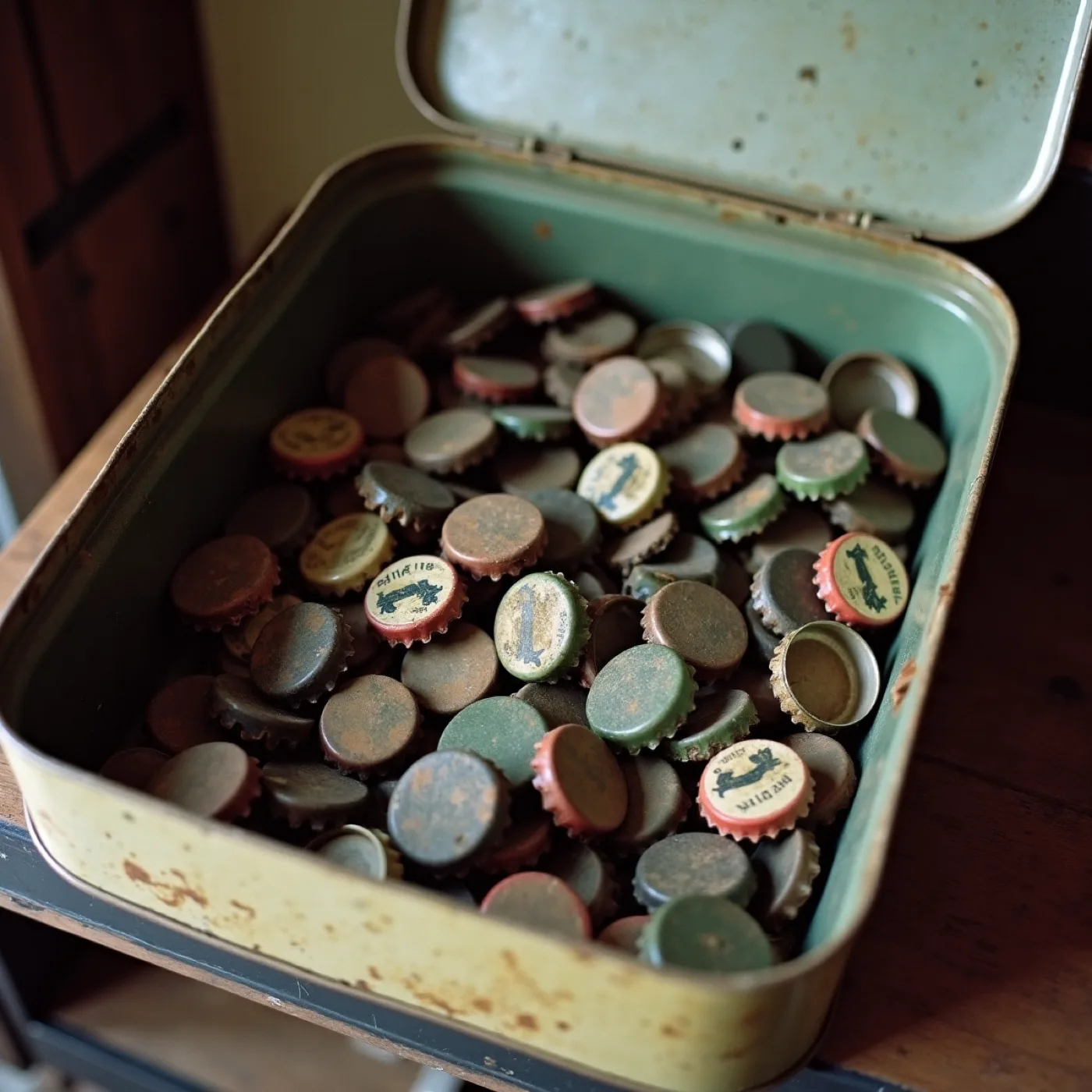
An open biscuit tin on a shelf, filled with hundreds of used bottle caps, dusty and faded.

Rafael's grandfather kept one of these, and it is the whole idea in a tin — an object that records years without anybody having designed it to. It is also why the yellow here is a cap faded in a shed rather than a screen primary.
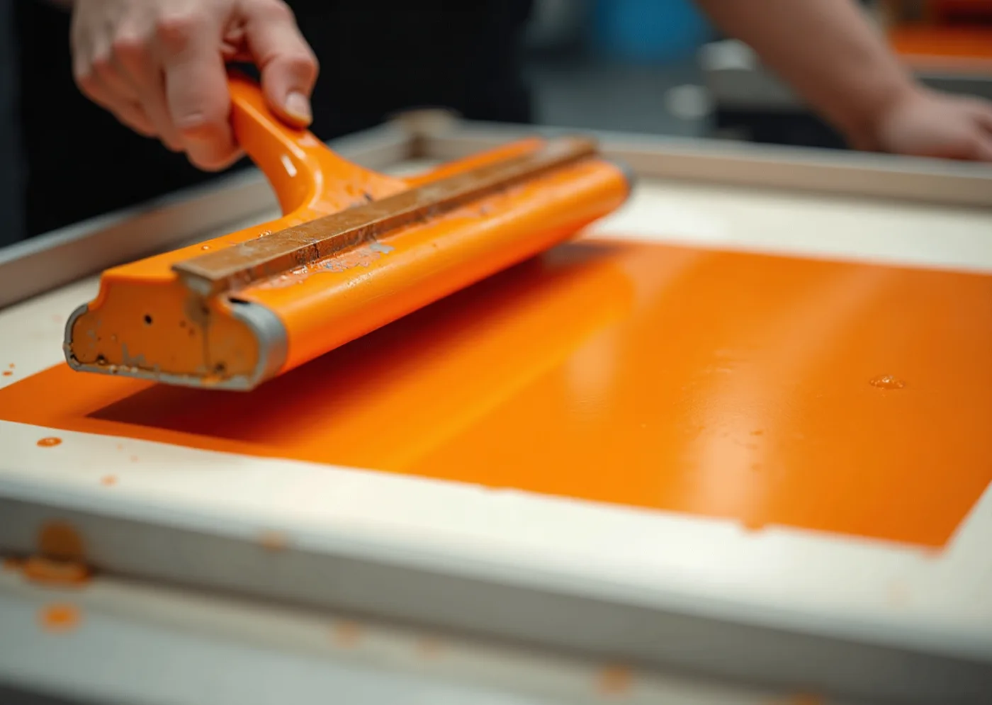
A squeegee being pulled through thick opaque ink across a screen over heavy white board, registration crosses at the corner, hands cropped at the wrist

Opaque ink laid thick, at the size it prints. This is the difference between a colour that sits on the sheet and one soaked into it — and it is why a ground can be solid enough to hold a knocked-out letter at arm’s length or across a lawn.
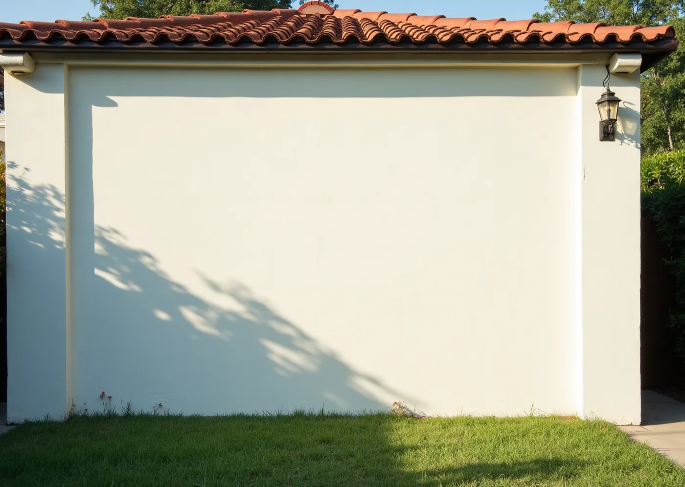
A whitewashed garage end wall in a Coral Gables garden in late-afternoon sun, blank, with the hard shadow of a barrel-tile eaves running across the top of it.

This is the wall the match is thrown onto at five, and until then it is the one flat white plane in the garden — everything printed has to hold its own beside a lit screen at dusk, which is the argument for grounds of solid colour rather than white cards with colour on them.
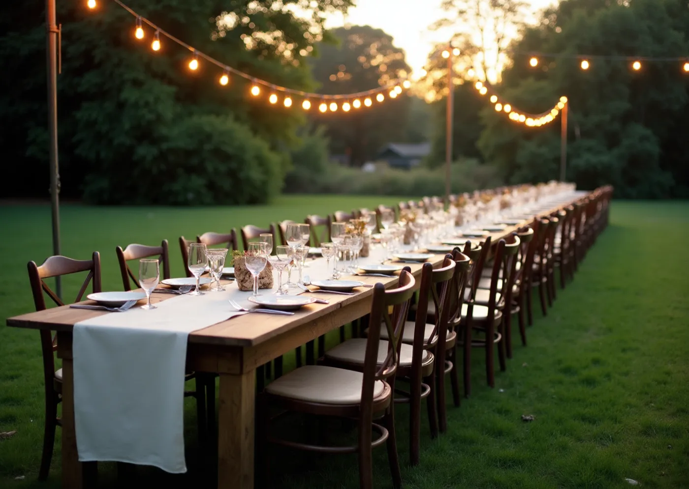
A long trestle table on a lawn under strung bulbs, seen down its length, with mismatched chairs and a paper cloth, empty of people.

The acceptance test, and it comes before the desk test — a city name has to be readable from the far end of the table by somebody standing up and not stopping, which is the reason one word is given a whole surface.

Guaraná yellow#F3B70CGround
Six o'clock blue#2557B5Second ground
Lawn green#43903FGround, outdoors
Tin-lid dark#17233AInk

Type specimen

BITTENCOURT

display — Hanken Grotesk at its heaviest, caps, tracked in tight, set at the size where it stops behaving as writing

24 JUNE 2027

figures — Hanken Grotesk tabular lining, judged by printing a 4 and a 7 at final size and reading them outdoors, not off a specimen sheet

Beatriz & Rafael · gates at four, kick-off at five · 1147 Alhambra Circle, Coral Gables · come in your colours

text — the same family, small, doing nothing but serving

One family throughout, because a second voice would argue with a word already ninety millimetres tall, and because the face that carries a date across a garden has to be the same one that sets a place card or the two stop being one object.

Materials & production

The same rigid uncoated board as any premium piece this house prints — roughly 500–650gsm, bright white through the sheet so a cut edge is white and a knocked-out letter is genuinely the board. Screen print, two or three opaque inks on any one piece and frequently one on a flood: ink laid thick is what makes a 90mm letter look painted onto a surface rather than printed onto a card, and it is the whole difference between this world and a large digital print of the same layout. The one piece carrying the empty field is proofed with a pen before it is proofed with ink — the printed ground has to take ballpoint and marker without beading or skipping, which rules out coating, varnish and foil across the suite and is the reason the finish is bare ink on bare board. The outdoor pieces go to a rigid outdoor substrate colour-matched against the paper pieces at proof rather than assumed to match. The painted edge the client mentioned belongs here and is the one embellishment this world will take: a colour edge on a white board reads as a fourth plane on a piece that has only ever had three, and it costs almost nothing.

Invitation

A wide rigid board flooded in one colour, the date knocked white out of it at ninety millimetres and read across a room before it is read in the hand. Your two names sit small at the foot in the same family; the back is a second flat field carrying gates at four, kick-off at five, and the address. A painted edge in the blue is the only embellishment this world takes, and the envelope liner is the third colour, so the suite has shown all three before the card is out.

Suite

Nine pieces where the ground colour changes rather than the layout: the menu yellow, the bar card blue, the eight table cards green because they stand on the grass. One idea per surface — a place card is a name, a table card is a city, and RIO DE JANEIRO fills its card edge to edge.

Signage & space

One word on a board leant against the coral-rock wall at the gate, read from the pavement before anything else. And the large panel you asked for: a field printed empty and ruled in these same inks, hung on the garden wall and filled in by hand match by match, which answers his grandfather's 1970 chart in Niterói instead of copying it.

Digital

The RSVP page is one word and one field, the date as large as the screen allows. The share image is the date alone at 1:1, legible at thumbnail size because it is four figures rather than a picture, and it survives being forwarded to sixty-four phones.

Guest arc

Read one word from the pavement before you reach the gate → find your table by a city name you can see standing up → and on the way out, the panel on the garden wall with somebody else's handwriting already on it.

The third reference, taken at its word You named three things: the tournament posters of the sixties, the azulejo panels, and Brazilian modernism — Magalhães, Wollner, the concrete poets. This direction takes the third, where the word is not a caption on a picture but the picture itself. That has a practical consequence as well as a romantic one: with nothing pictured anywhere, there is nothing in the system that can drift toward merchandise.

The colour we never print The ruled field goes up empty and is filled in on the day, in whatever pen is on the table, so the red on your garden wall in July was put there by somebody at the party rather than by us. It is deliberately not one of the four inks, and it is the reason the printed ground has to be bare ink on bare board with nothing coated over it.

Still open in this world
  • Whether our colour survives a garden wearing the same colour. You asked everyone to come in their colours, so by five the garden is full of the same yellow, blue and green we are printing. A flooded ground works because it is the loudest thing in the frame; on a table of people already wearing it, it may simply join in. That gets settled by proofing a card outdoors against a shirt, not by looking at a board.
  • Whether one idea per surface survives the menu. The rule holds for a name, a city, a date. Then the menu arrives with thirteen dishes and three dietary marks that have to be clear enough that nobody has to ask, and either the rule bends on the fourth piece or the menu becomes three cards.
  • Whether the empty field survives June outdoors. It has to take a ballpoint over screen ink, on a wall, in Miami damp, and still be worth keeping afterwards. We have not proofed ink over ink in those conditions, and it is the one piece in the suite we cannot reprint on the day.
  • Whether a mark cut from a letter stays the family's. Building it out of the suite's own B is what lets anybody re-strike it in 2031 and 2035 from type alone, which is what Rafael asked for. The risk is that it then belongs to the typeface: change the face in eight years and the mark changes with it. Drawing it once and keeping it as artwork closes that off, and gives up the easy re-striking.
Direction B
The world of the wall

The Tile Wall

The invitation is one panel prised off a tiled wall in Rio — a grid of flat squares where each tile holds one reduced picture and the wall only makes sense whole. Printed in four colours and no more, hard-edged, nothing shaded. It is the whole country in nine flat pictures.
flat colour, hard edges nine squares, one wall no gradient anywhere white is a colour, not a gap
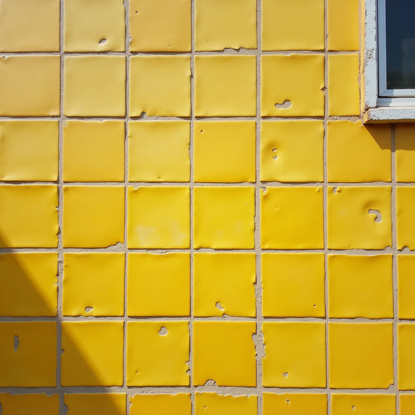
The glazed tiled exterior of an ordinary building in Niterói, photographed square-on in full sun and filling the frame, with chips, replaced tiles in slightly wrong colours, and visible grout.

Beatriz's mother came from Niterói in 1988, and this is what an ordinary building looks like there — it argues that colour on a plane is public architecture rather than ornament, and that the wrong-coloured replacements and the grout are part of how it reads, not damage to it.

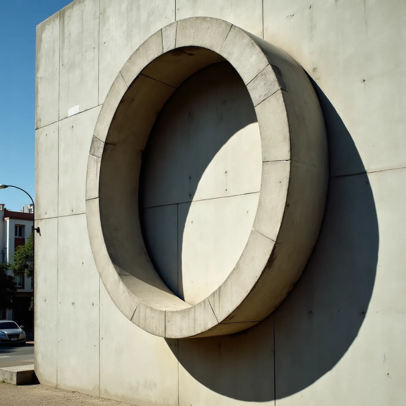
A civic wall treated as a flat plane of applied colour — painted concrete panels with a brise-soleil throwing hard geometric shadow across the coloured face.

The precedent for treating a whole face as applied colour, and for that being civic rather than decorative — it also shows what tropical light gives you free: the shadow is a second graphic on the wall and nobody drew it.

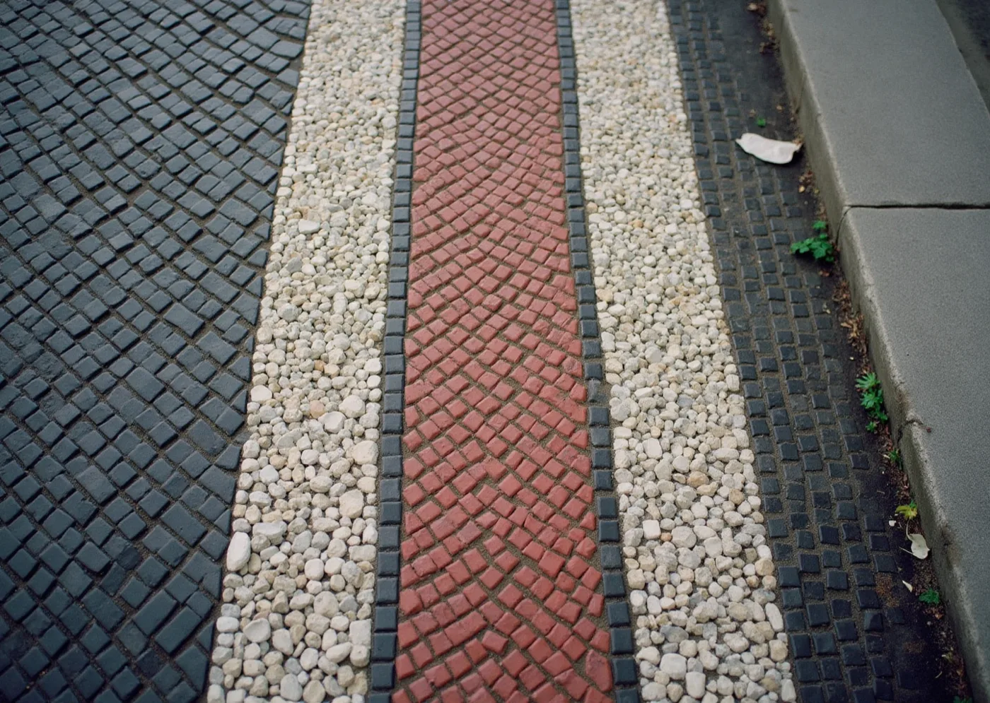
Modernist mosaic pavement seen from directly above — small stones laid in a bold curving pattern, worn smooth, with one section visibly repaired.

Decades of feet, and the surface still reads — this is the durability argument: something laid one small piece at a time takes wear and repair without losing what it is, which is a claim this world has to make about paper left on a table all afternoon.

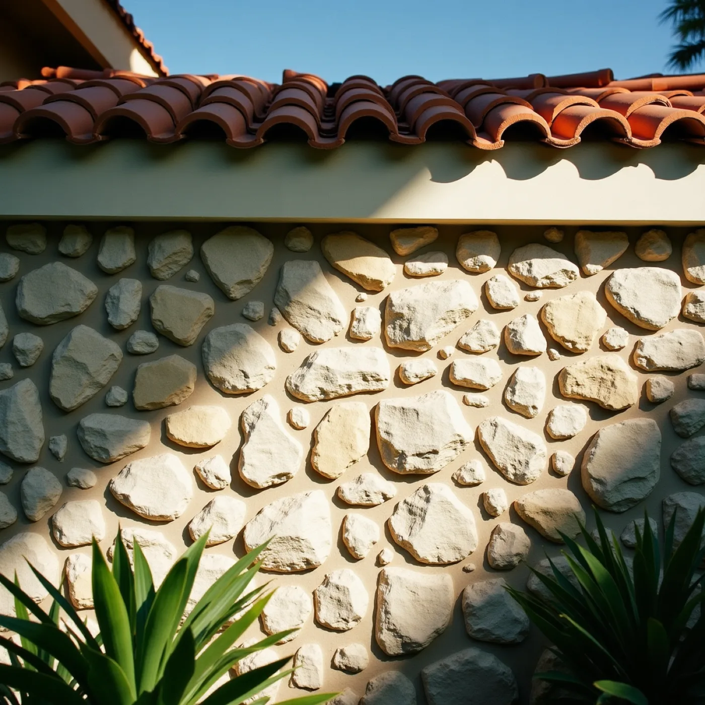
A rough coral-rock garden wall photographed square-on in hard midday sun, with the shadow of a barrel-tile roof edge cutting a hard diagonal across it.

Coral Gables has been putting flat colour into hard light since 1926, so this is not a Brazilian idea being imported onto your street — it is one arriving where the conversation is already happening. It also sets the level any printed colour has to clear, because coral rock and barrel tile are not quiet neighbours.

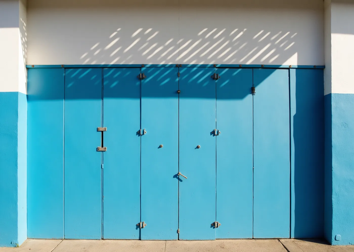
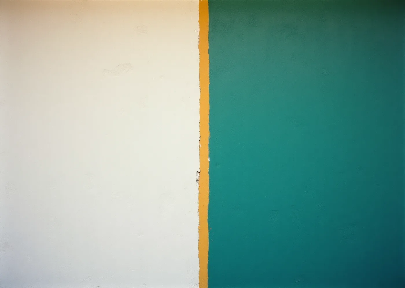
A single saturated painted wall at the hottest hour of the day, half of it blown out in direct sun and half dense in deep shade, with a hard diagonal between the two.

The palette tested rather than asserted — you described the light as hard and high until about seven and then gold very fast, so a colour that holds in both halves of this photograph is one we can print, and one that does not is not in the set.

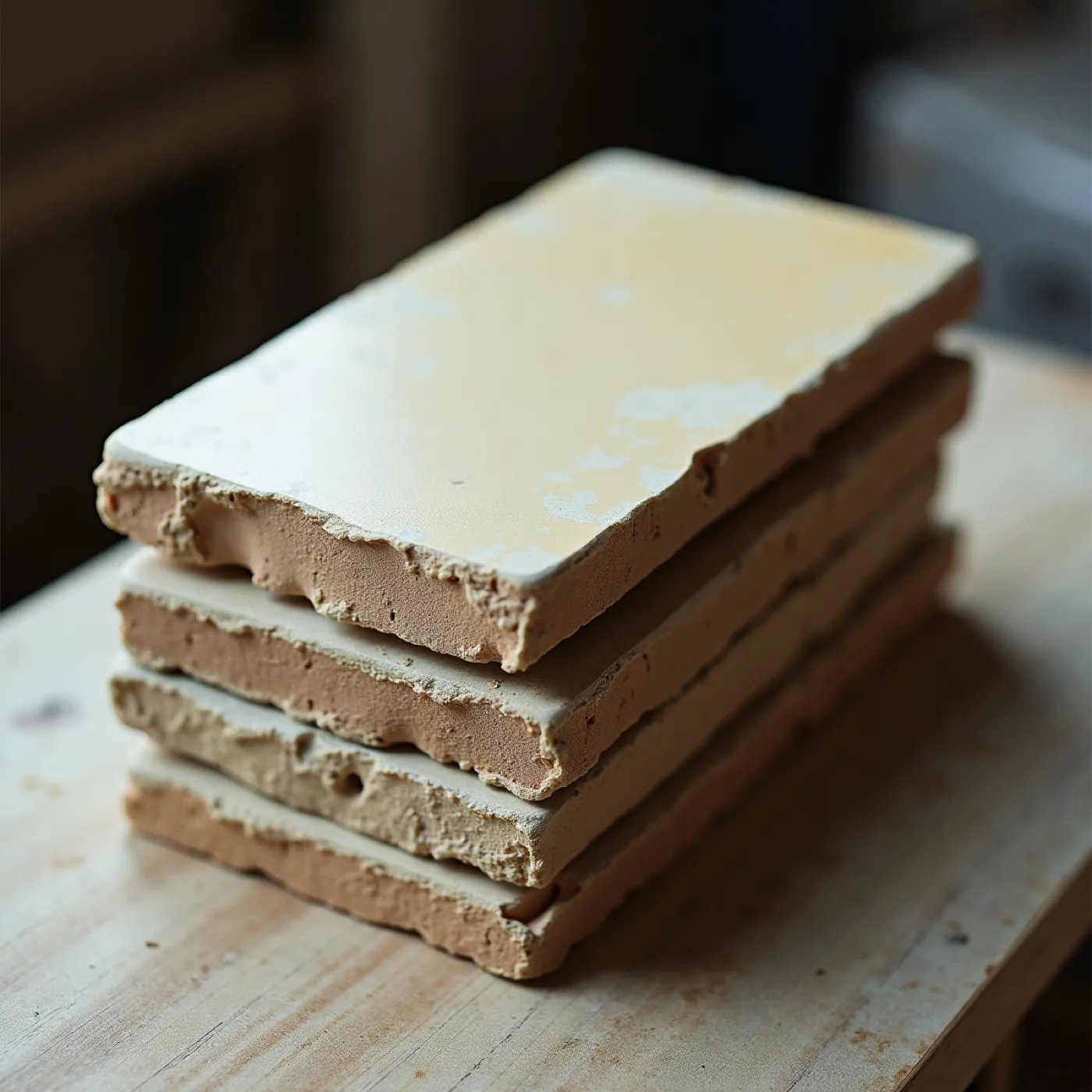
A close macro of glazed and unfired tiles on a workbench — chipped edges showing the ceramic body beneath, glaze pooling at one corner, one tile in sun and one in shade.

Where these colours come from — a fired cobalt sits deeper and greyer than a printing blue, which is why the palette was argued out of glaze and a garden in June instead of picked off a chart, and why it behaves outdoors the way it does.

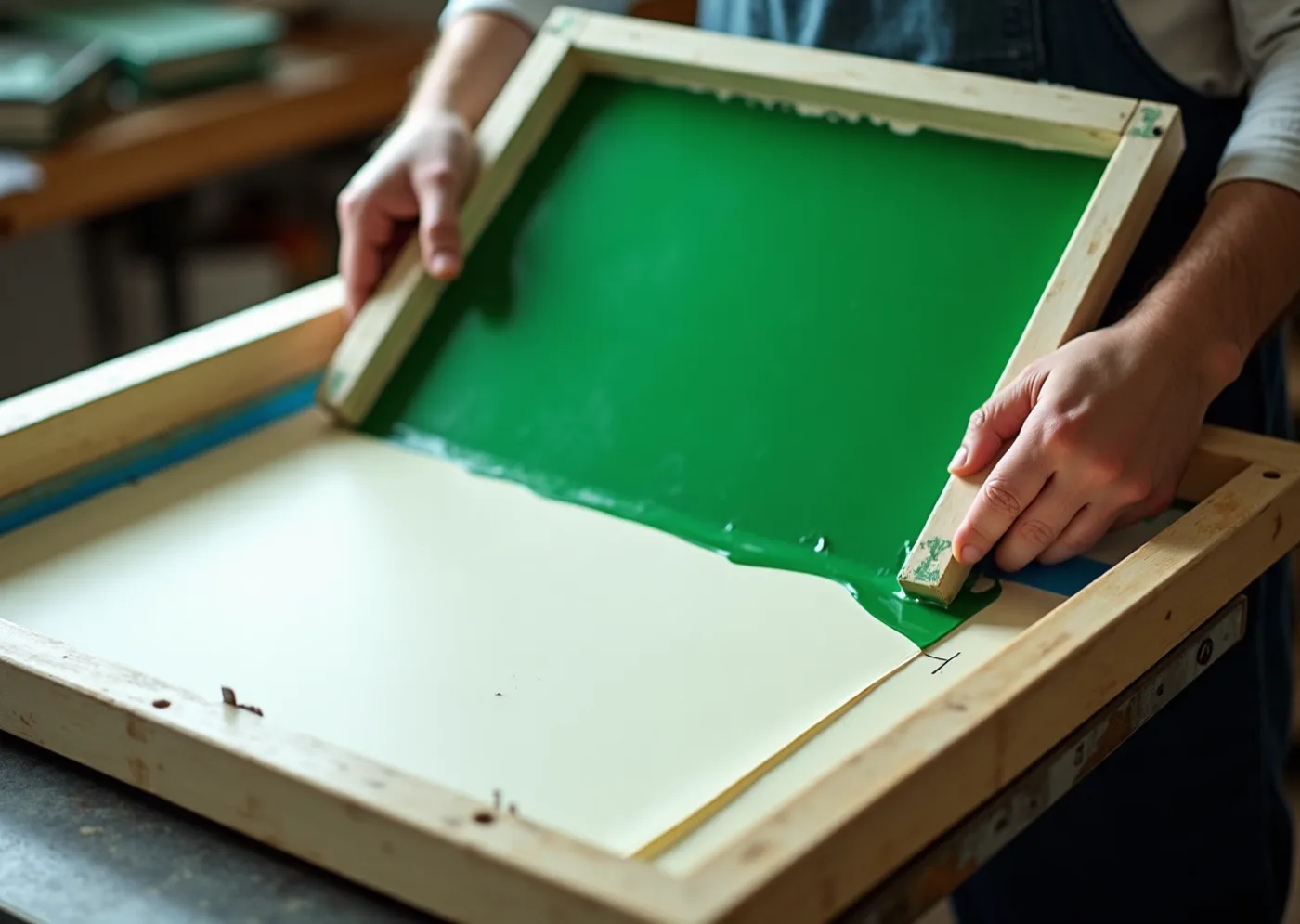
A flood coat of opaque green ink lifting from a screen over heavy uncoated board, the ink standing proud of the sheet, registration marks visible, hands cropped at the wrist.

The production proof behind the words you used: flat, hard-edged, nothing shaded — screen ink sits on top of the sheet instead of soaking into it, so the edge on paper can be as hard as the edge on screen, where an offset press would soften exactly the quality you asked for.

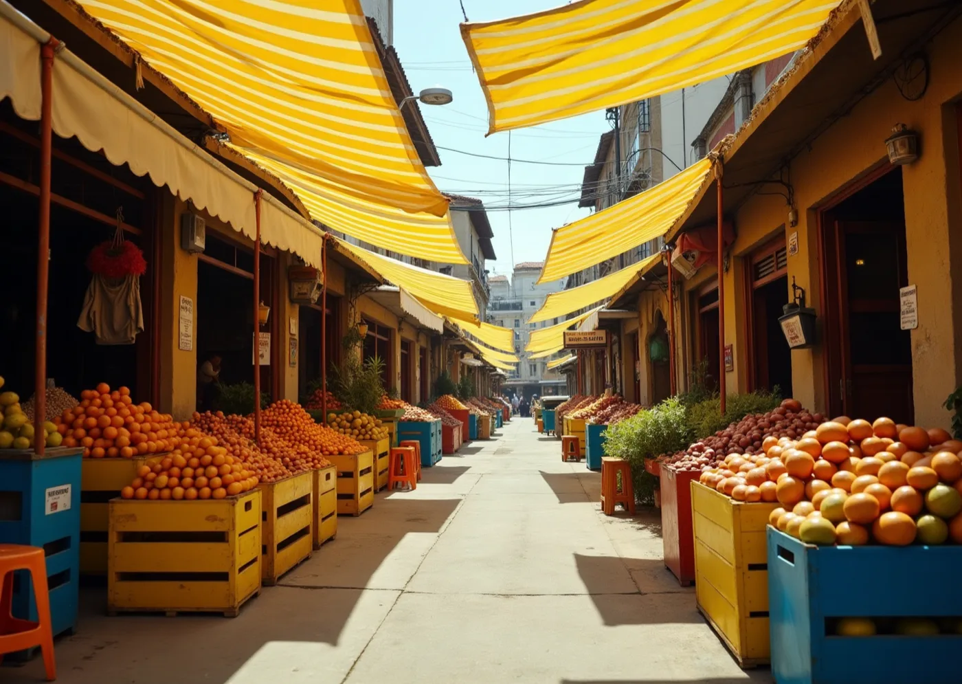
A street market under striped awnings in strong sun, seen down the aisle, with painted crates, tubs and stools in flat saturated colour filling the frame.

Joy with no party-supply aisle anywhere in sight — flat opaque colour as an everyday environment rather than as a special occasion, and the evidence that abundance and discipline are not opposites, which is the whole bet this direction makes.

the wall this comes from — glazed squares on a mid-century building, the colours already sitting in hard sun
palette in context — the four glazes on the studio table, chipped corners showing the ceramic body
V
Bottle-cap yellow
#F5C400
Lead
Cobalt
#2E63D6
Support
Pitch green
#3E9E43
Panel ink
Deep cobalt, for reading
#14306B
Ink
the finish — opaque yellow screen ink standing proud of uncoated board, shown at print scale
Type specimen
Bittencourt
display — Hanken Grotesk Bold, set tight in caps
Thursday 24 June 2027 · gates at four
1147 Alhambra Circle, Coral Gables
text — Fraunces
The sans leads because it is built from the same straight edges as the tiles — and the serif is kept for reading, so the detail lines never turn into more graphic noise.
the stock — bright white board, so the white in the grid is paper, not ink
THREE BY THREE · 8MM GUTTER · NO PANEL REPEATS ACROSS A PIECE
The grid is not decoration — Beatriz named the azulejo panels of Rio and Niterói as one of three references. The tile is the unit of that tradition: one small picture per square, meaning assembled across the wall.
Five trophies, drawn as a repeat — the second reference was the sixties and seventies tournament posters, where a whole country was reduced to a handful of forms. Every panel here obeys that: one idea, flat, no shading.
Screen ink, because the brief bans gradients — opaque flat inks are literally how this is printed. The colour sits on the sheet rather than soaking into it, which is what makes the edges as hard on paper as they are on screen.
What this world does to each of your nine pieces
InvitationA 148mm square — the tile's own proportion. Nine panels on the front, the wall entire; the back is one flat yellow field with the details set in deep cobalt. Screen-printed on bright white board so the white squares are paper.
Save the DateOne panel only, at full bleed — the Southern Cross, nothing else, with the date in the corner. It is the wall's first tile, and it tells the guest that eight more are coming.
Welcome SignageThe wall at a metre square by the gate, panels enlarged so the grid reads from the pavement. This is the piece Rafael hangs on the garden wall afterwards — it is built to survive the party by design.
Menu CardA tall card with a single column of three panels down the left edge — stadium, plume, keys — and the courses set beside them in the serif. Dietary marks are small cobalt squares, on the grid.
Bar & Drink MenuYellow field, cobalt type, one panel at the head: the sun. Five drinks, one line each. The flat ground survives being splashed and still reads across the garden.
Table NumbersEight cards, one panel each, no panel used twice — so the tables are told apart by picture before anyone reads the city name beneath. The ninth panel is held back for the welcome sign.
Place CardsFolded tents in white board, one 22mm panel at the left and the name in bold caps beside it. The children's cards carry the trophies panel, which they will fight over, which is the intention.
Custom MonogramFour squares in a two-by-two — yellow, white, white, green — with the V set tight beside them. It is the wall reduced to its smallest possible piece, carries no year, and holds at 8mm.
Thank You CardThe wall again, but in white on white — the same nine panels blind-debossed into the board with no ink at all. The loudest piece in the suite and the quietest one are the same picture.
DigitalThe RSVP page lays the nine panels as a responsive grid that reflows to three at phone width; the panel behind the submit button is the goal. The WhatsApp share is a single panel, because a thumbnail can only hold one.
The guest arcArrive at a wall of nine pictures → find your table by the picture, not the number → leave with one panel on a card, the tile you were sat under.
Choose this if You want the invitation to be the party — abundant, flat, unmistakably Brazilian, and readable from the far end of the garden by a child who cannot yet read. This is the world where the design says everything at once, and where one piece of it ends up on the wall in Niterói's place.

The two, side by side

The same family, the same Thursday, the same three colours off the flag. What changes is whether the design reduces the day to one mark or opens it out into nine.

  Direction A — The Word Itself Direction B — The Tile Wall
What the guest is handed A wide green card with one white line across it and nothing else. A square card carrying nine flat pictures — the whole country at once.
Format & stock 210 × 105 mm, green board dyed through so the cut edge stays green. 148 mm square — the tile's own proportion — on bright white board.
Where the accent goes One white foil hairline, on the invitation only. The amber never prints — it is only ever a bulb in a photograph. There is no rationed accent: four flat inks share the sheet, and white is one of them. The restraint is the count, not the placement.
Imagery strategy Photographic. Real grass, real chalk, real light — nothing is drawn. Drawn. Flat vector panels, hard edges, no photograph anywhere on a piece.
Type Fraunces leads; Hanken Grotesk in spaced caps carries the details. Hanken Grotesk Bold leads in tight caps; Fraunces carries the reading.
The repeatable mark A centre circle with a rule through it — the oldest mark in the game.
Four squares in a two-by-two — the wall at its smallest.
The risk it carries A guest who wanted a party may read it as austere before they arrive — the design withholds on purpose, and not everyone likes being made to wait. Abundance is one bad decision away from the sports bar you asked us to avoid. It only works if the drawing stays disciplined and no panel is ever repeated on a piece.
The piece it gives you free The place cards — a name and a 3mm line is already the whole design. The welcome signage — the wall at a metre square, which outlives the party on the garden wall.
Direction B — The Tile Wall — is the world that was built. Every piece in the suite descends from it; The Word Itself was not carried forward.

See the finished suite →