Marlowe · Friendsgiving · November 2026 · Apartment 5B, Brooklyn

Two ways to print
one red marker.

You asked for one ink on warm paper, drawn rather than designed, and for nothing that looks expensive — only something that looks like it took attention. Both worlds below keep that promise exactly. They differ in one thing: whether the ink is drawn on the paper, or whether it takes the whole sheet and the paper becomes the words.

Direction A

The world of the afternoon

One Red Marker

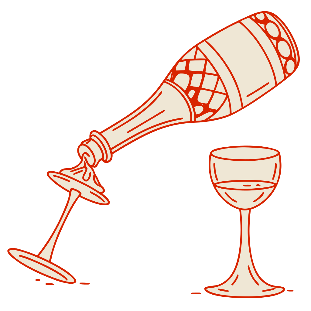
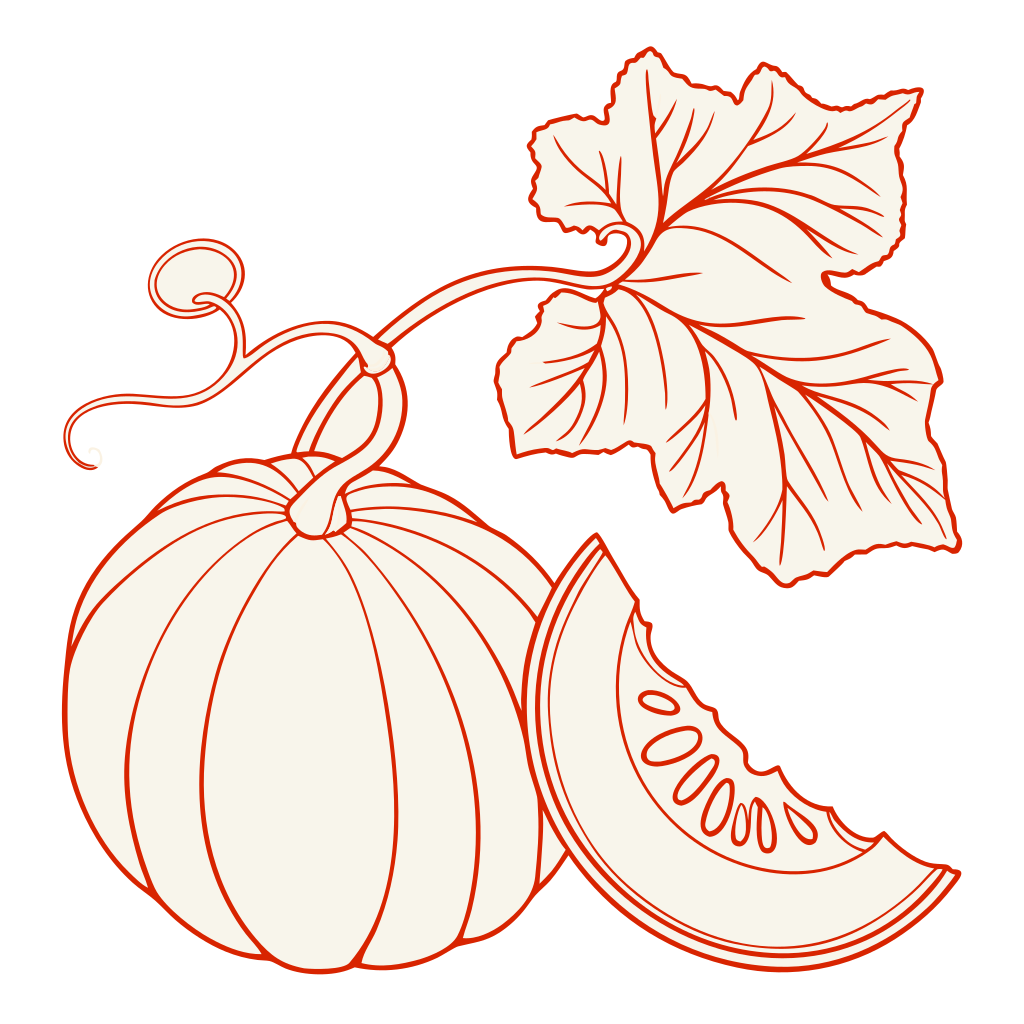
Somebody sat at the kitchen table an hour before any of it existed and drew the whole thing — the platter, the bottle with the ribbon, the good glasses, the squash — and then wrote the invitation in the middle of it.

  • One ink, and a second tone is only that ink printed heavier
  • Every object drawn is an object that will be in the room
  • The drawing bleeds off all four edges — nothing is framed
  • The middle of every piece stays bare paper
  • The hand is allowed to show

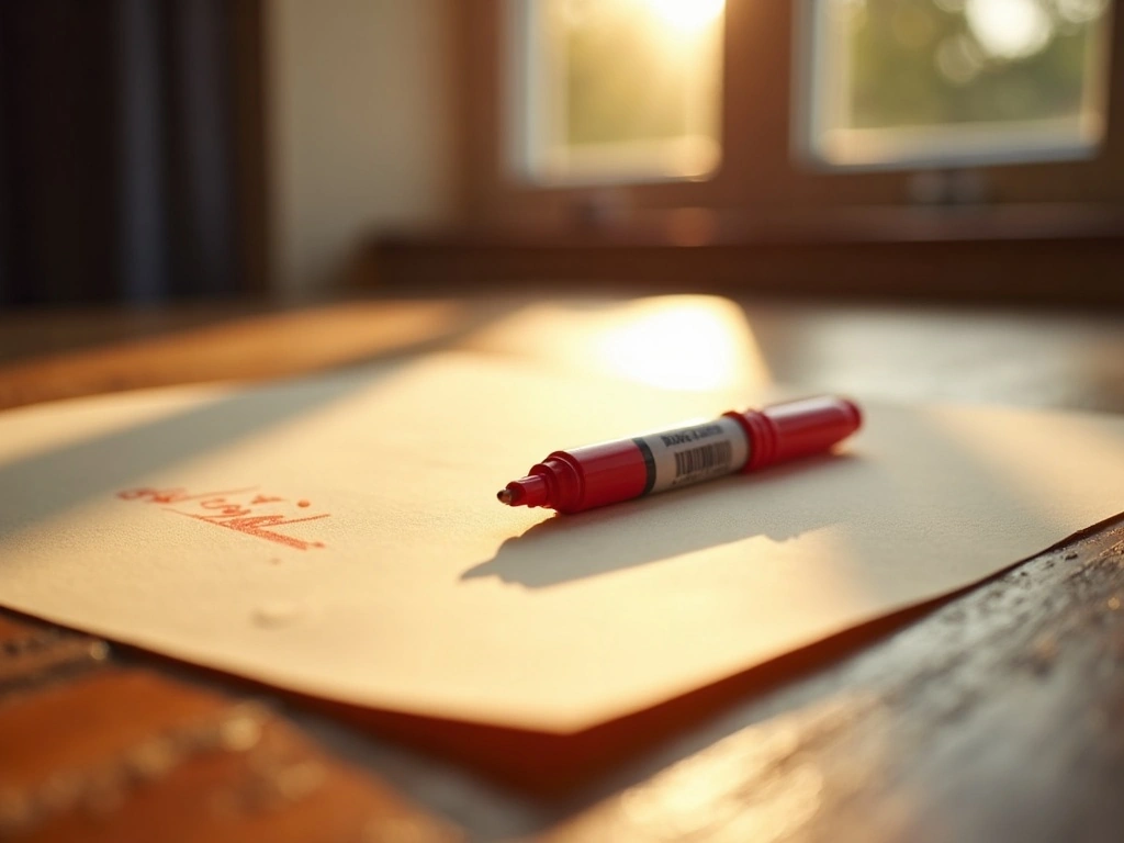
The stroke itself, at print scale — a felt-tip on uncoated cream. This is the entire visual system: one pen, one pressure, nothing behind it.

Four o'clock in November — the one hour of low orange light the front room gets.

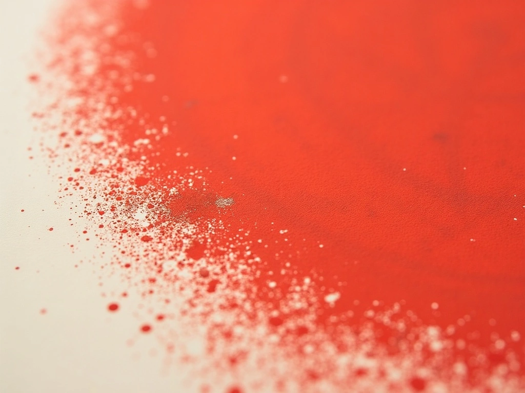
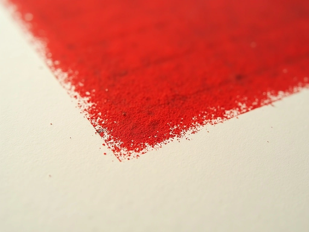
Risograph at the edge of a solid — uneven roller, slight misregistration. The "cheapness" you asked for is a real production choice, not a filter.

Type specimen

Friendsgiving the name — Sriracha, a felt-tip brush script
27.11 / 4:30 PM the display — Chewy, drawn numerals
Junie Marlowe & Theo Abara the hand — Caveat 600, everything else
Apartment 5B, 214 Vandervoort Avenue · Brooklyn the fine setting — Caveat 400, address and RSVP

Three faces, one hand. The script is allowed exactly one job — the word Friendsgiving — and never appears again anywhere in the suite.

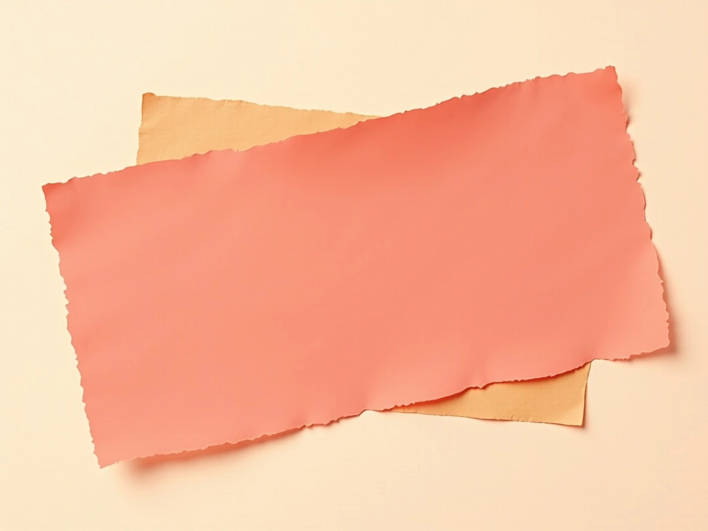
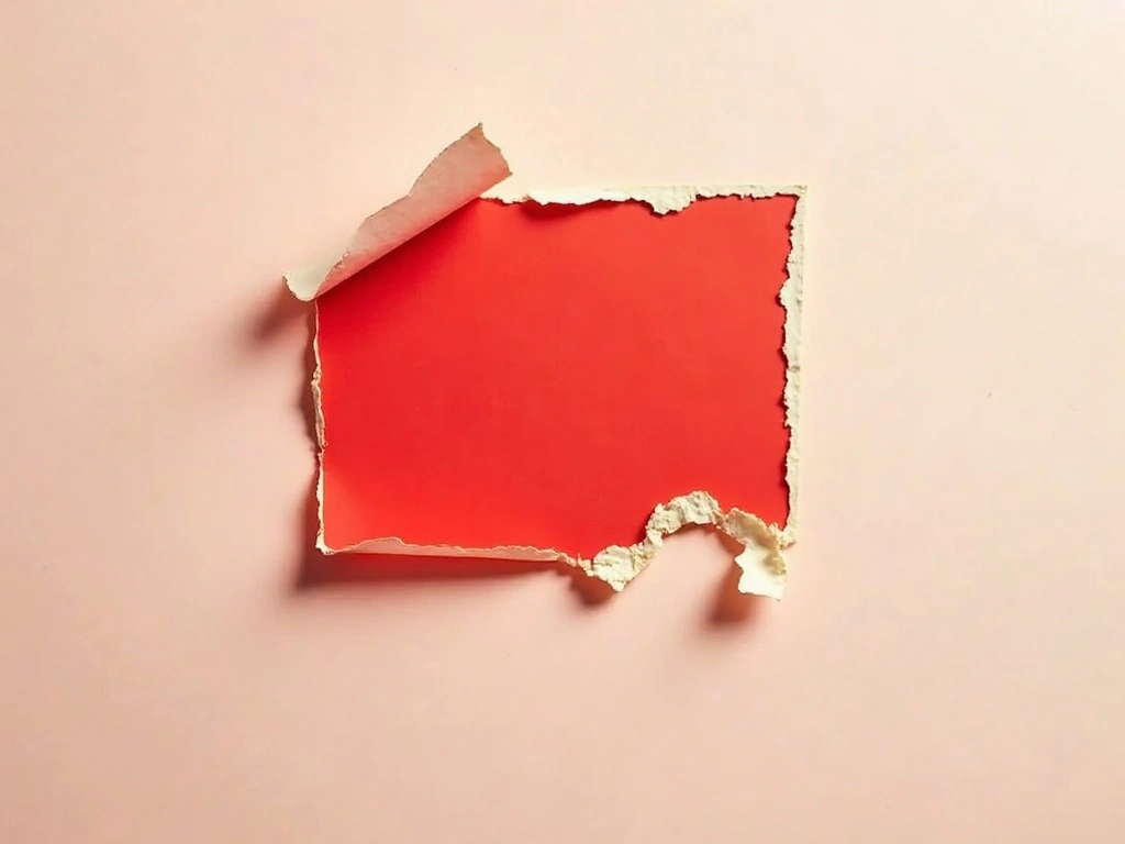
The two colours as paper and ink, not as swatches — torn cream stock over a solid printed block.

Butcher-paper cream#FAF2E3 · the ground
One red#C6371A · the ink
Pressed harder#8E2B14 · the accent

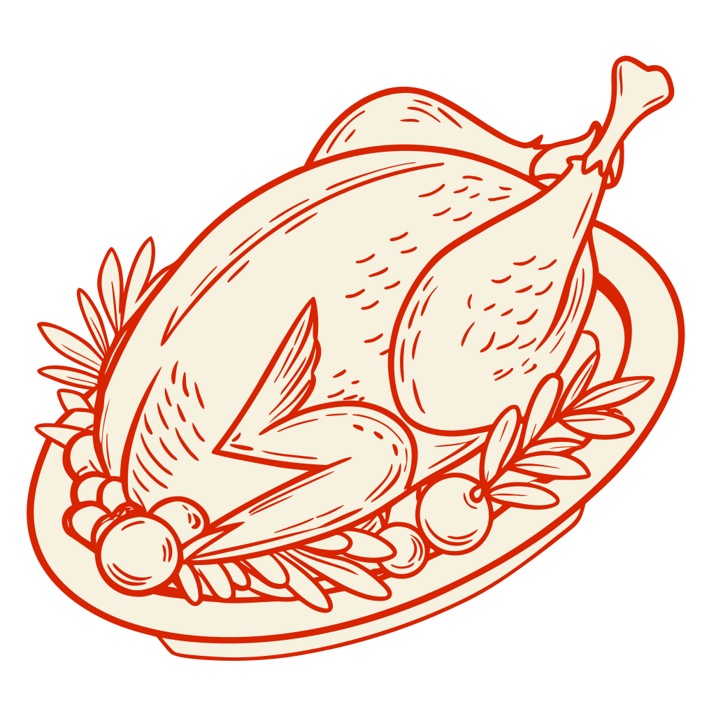
The mark of the world — an open contour, no fill, no shading. Your mother's oval platter, and it is drawn the way everything else in the suite is drawn.

Uncoated natural, on the heavy side One drum on the riso. The tooth is the reason the ink breaks up at the edge — it is the stock doing it, not an effect.
What each of your nine pieces becomes in this world

Invitation

Portrait, one side drawn and one side working. The front carries your five lines and nothing else, ringed by eight objects that bleed off every edge. The back holds the address, the hosts, the RSVP — and two ruled lines under "You're bringing", left empty for you to fill in by hand on each of the twenty-two.

Save the Date

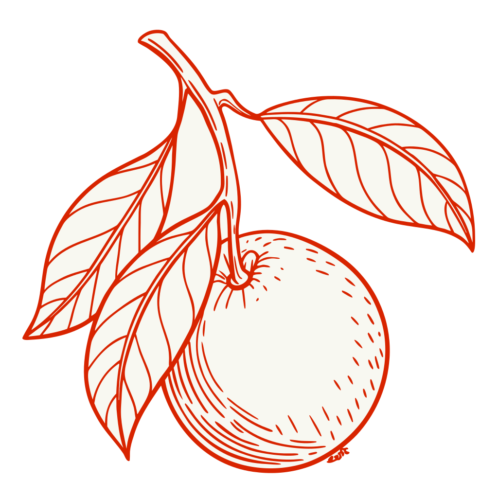
A smaller card that is almost all paper: the date at the size the invitation gives the name, one drawn clementine, and the single line that matters — the Friday after, so nobody has to choose. Posted in September, it should look like a note rather than an announcement.

Menu Card

One uncoated leaf per two guests, laid down the butcher paper. Courses are ranked in the same column the invitation uses, and each dish is named with the person who brings it — Priya's dal, Rosa's stuffing, Theo's cornbread. Dietary letters sit after the dish in the same ink, never as a coloured dot.

Place Card

A small folded tent, with one drawn object per card so no two people get the same one. The name is written in the hand face at 16pt — over the 14pt floor, because it is read across a crowded table by somebody standing up.

Table Number

There is one long table, so this becomes what it actually needs to be: two ends. A double-sided A6 tent reading "This end" and "That end", with the numerals set in the drawn display face, big enough to find from the door.

Welcome Signage

A5 on the apartment door, in a hallway with one working bulb. The drawing thins out and the type takes over: the name at 120 mm cap height, readable from the top of the stairs, plus the one instruction that saves twenty-two phone calls — fifth floor, no lift, push the door.

Bring-a-Dish Card

The piece this suite exists for. A narrow slip that tucks behind the invitation: the dish, the rough quantity, and the oven time it needs, so the kitchen is not negotiating at four o'clock. Set as a note, not a form.

Leftovers Tag

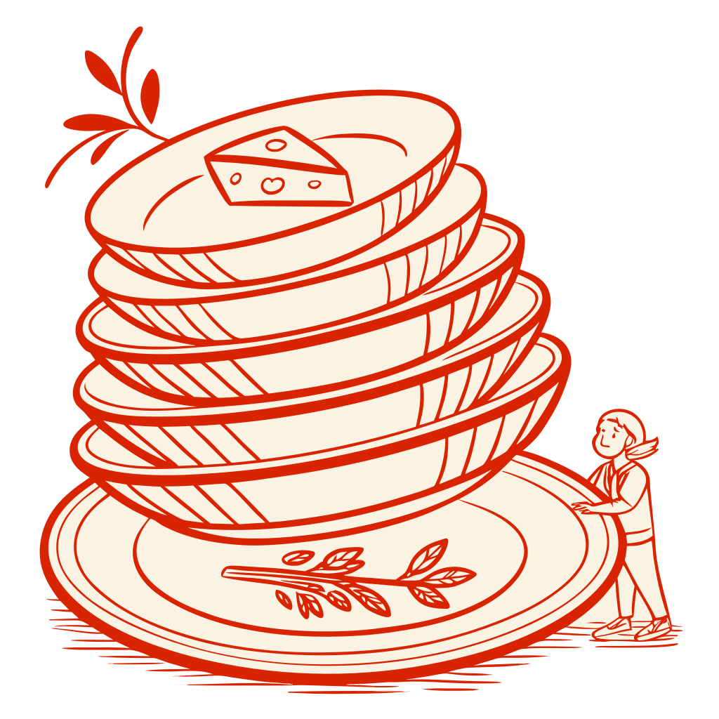
A small punched tag on the counter by the foil. One drawn plate stack, one ruled line for a name, and the joke that is actually a rule: nobody leaves empty-handed. It is the last printed thing anybody touches.

Thank You Card

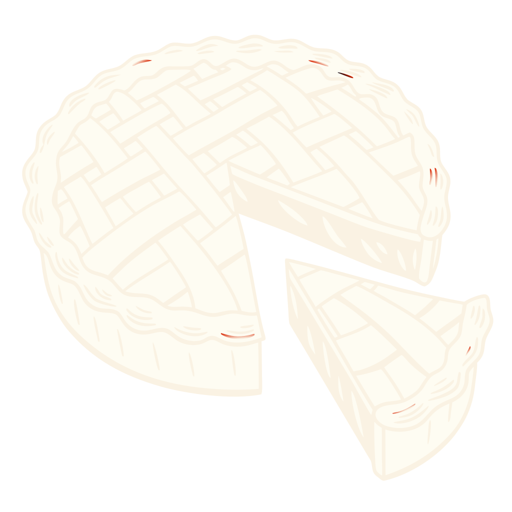
The save-the-date's size again, and the only piece where the drawing is allowed to be a single object alone in the middle — the pie, because there are always two and somebody always brings them. Space is left for three handwritten lines.

Digital

The RSVP page is the invitation's back, scrolled: same cream, same ink, the dish assignment as the one field that matters. The share image is the card front cropped square, and it survives being screenshotted badly.

The guest arc

Door: the sign tells them they have arrived and that there are stairs. Table: their name on a tent card and their dish on the menu, in print, in front of everyone. Leaving: a tag on a foil parcel with their name on it.
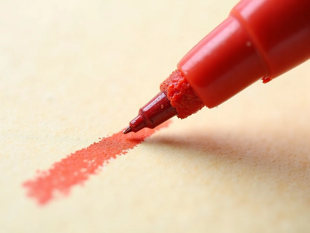
Why the stroke is the hero. You wrote that it should look like felt-tip on the back of a menu. That is a line quality, not a subject — so the board opens on the line itself rather than on a picture of a dinner.

Risograph, one drum. Your reference to riso zines and gig posters is a printing process, and it is the cheapest one that gives this exact broken edge. It also means the second tone costs nothing: it is the same ink, printed heavier.

The objects are yours. The platter, the bottle with a ribbon on it, the good glasses, the squash — each one comes from a line in your brief. Nothing generic to the holiday appears: no cornucopia, no falling leaves, no pilgrims.

4:30 is a colour, not just a time. The hour you keep out of superstition is also the hour the room turns orange. It is why the paper is warm cream rather than white — the card has to look right in that light, on that table.

Still open in this world
  • Whether eight objects per piece is a number or an accident. Ringing the card with eight is the current rule. Six may be better and four may be the actual idea.
  • Whether the riso broken edge is reliable enough for the invitation, or only good enough for the pieces that live in the room and get handled once.
  • Whether the hand-written “You're bringing” lines beat a printed field. Writing twenty-two by hand is the warm answer and the one that gets abandoned at eleven at night.
  • Whether three faces is one too many. The script has exactly one job. If it loses that job the world gets simpler, and probably not worse.

Direction B

The world of the plan

Knocked Out

The sheet is solid ink edge to edge and the afternoon is cut out of it in bare paper — every dish, every hour, ranked down the page. What arrives is not a card about the day. It is the day, printed.

  • The colour owns the sheet; the paper becomes the type
  • Flat mass only — no contour line anywhere
  • Information is a running order, not a composition
  • One silhouette per piece, never a scene
  • Hard edges; the only softness is the ink squeeze

A solid sheet with the shape torn out of it — everything this world says is said by removing ink, never by adding a line.

The same two colours — meeting at a hard straight edge instead of a drawn one.

Screen print at the boundary — the ink squeezes out a fraction. At this weight of coverage that is the only irregularity you get, and it is enough.

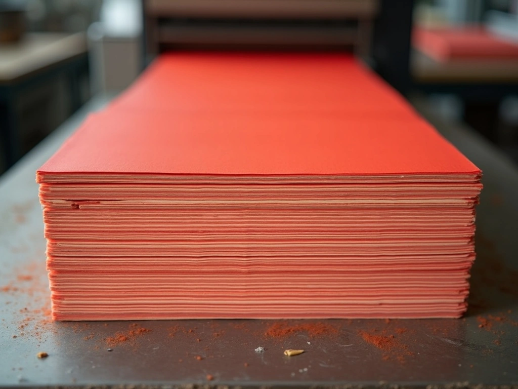
Two hundred sheets off the press — one pass, one screen, twenty-two of them posted and the rest on people's fridges until November.

Type specimen

FRIENDSGIVING the name — Chewy, set as mass, letterspaced
4:30 · 5:15 · 6:00 the running order — Chewy again, ranked
Priya's dal with burnt garlic the hand — Caveat 700, the only soft thing left
Fifth floor · no lift · push the door the fine setting — Caveat 400, knocked out of the ink

No script at all in this world. The name is set in the same drawn display face as the times, because here it is one more item on the list.

The mark of this world is a solid — filled, stencilled, framed. Deliberately the opposite species to Direction A's open outline, so the two can never be confused for one another.

Same stock, heavier ink The same uncoated natural again, but screen-printed at full coverage — the sheet cockles very slightly and that is the point.

The knock-out at close range — the paper is not printed white, it is simply never printed.

What each of your nine pieces becomes in this world

Invitation

Portrait, printed solid on both sides. The front is a poster: the name knocked out huge across the top, then 4:30, then the address, ranked down the sheet in decreasing size. The back is the running order of the afternoon, hour by hour, with your line cut out of the ink at the bottom.

Save the Date

A single smaller flooded card with three things reversed out and nothing else: FRIENDSGIVING, 27.11, and "the Friday after". It is designed to survive being a magnet on somebody's fridge for nine weeks.

Menu Card

One long solid leaf with the courses cut out of it as a numbered list, cook's name set beside each dish in the hand face — the only soft type in the world, and it earns the contrast. Dietary letters are knocked out in a fixed column.

Place Card

A small flat card, fully inked, the name reversed out at 18pt. No object, no ornament: on a table of twenty-two solid red cards, the run of them down the butcher paper is the decoration.

Table Number

Two A6 tents, "THIS END" and "THAT END", knocked out of solid ink at the largest type in the suite. On one long table these are the only two navigational objects, so they are treated as signage rather than stationery.

Welcome Signage

A5 flooded solid on the door — the loudest thing in a dark hallway, which is exactly what a single working bulb needs. Name, floor, and "push". Reversed white-on-red reads further in bad light than red-on-white does.

Bring-a-Dish Card

A slip printed as a ticket: solid ink, the dish knocked out in the display face, quantity and oven time in a fixed two-column grid beneath. It looks like a job docket, because that is what it is.

Leftovers Tag

A small solid punched tag, name written straight onto the ink in a white pen left in the bowl beside it. The only piece in either world where the guest adds the mark rather than the printer.

Thank You Card

The inversion: this one piece is printed the other way round — bare cream with a single solid silhouette — so that the last thing they get is the quiet one. It is also the cheapest sheet in the run.

Digital

The RSVP page is a full red screen with the fields cut out of it. The share image needs no crop: the card is already a poster, and a poster is already the right shape for a phone.

The guest arc

Door: a red rectangle visible from the stairwell. Table: twenty-two red cards in a line down the paper. Leaving: a red tag with their name written on it in white, by them.

Why this is not just Direction A inverted. The technique changes, not the colour scheme: there is no drawn line anywhere in this world. Every shape is a solid, and every word is an absence of ink.

Screen print, not riso. Full coverage is the one thing a riso drum does badly — it streaks. So this world changes process, and with it the price: fewer sheets, more ink, still one colour.

One mark, used once per piece. Where Direction A rings the card with eight objects, this world allows exactly one silhouette per surface. Restraint is doing the work the drawing does over there.

The risk, stated plainly. A sheet this loud is harder to hand-write on, and your line about writing on every card by hand is why the leftovers tag comes with a white pen rather than a ruled space.

Still open in this world
  • Whether a sheet this loud can be written on at all. The leftovers tag already needed a white pen. If the place cards need one too, this is a different suite from the one described.
  • Whether full-coverage screen print is honest about the price. It is fewer sheets and more ink than the riso, and the brief asked for cheap-looking rather than cheap.
  • Whether the thank-you inversion is a relief or a break in the logic. One bare cream piece at the end is the kindest note, and the only piece in the world that does not obey the world.
  • Whether one silhouette per surface holds for nine pieces, or whether the menu and the bar list quietly need two and the rule dies without anyone saying so.

One decision

Which one is the eighth Friendsgiving?

Choose Direction A if…

You want it to look like somebody made it.

The pleasure is in the hand — in the fact that the objects around the edge are your objects, drawn, and that there is bare paper left for you to write on. It is warm before it is clever, and it will read as generous rather than as designed.

Choose Direction B if…

You want it to arrive like a poster.

One loud sheet that says what is happening and when, survives nine weeks on a fridge, and makes twenty-two red cards down a long table into the decoration. It is confident before it is warm, and nobody will mistake it for a wedding.

The real differenceDirection A · One Red MarkerDirection B · Knocked Out
What the guest is handed A cream card with a drawing on it A solid red sheet with the words cut out
Where the ink sits On roughly a fifth of the sheet — the paper leads On all of it — the colour leads and owns the surface
Imagery strategy Eight drawn objects per piece, bleeding off every edge One flat silhouette per piece, never a scene
Type A brush script for the name, a drawn display for the date, a hand for the rest No script at all; the name is set as mass in the same face as the times
The repeatable mark An open contour — the oval platter, redrawn at every size A filled stencil in a hard geometric frame
How the potluck line works Two ruled lines you fill in by hand on all twenty-two A knocked-out ticket field, printed per guest
Production Risograph, one drum — cheapest, and the broken edge is free Screen print at full coverage — more ink, fewer sheets, still one colour
The risk it carries Loose enough that it must be drawn well or it reads as unfinished Loud enough that the room can only take it on paper, not on the walls

Direction A — One Red Marker — is the world that was built. Every piece in the suite descends from it; Knocked Out was not carried forward.

See the finished suite →