Trevaskis · Restaurant Opening · 21 May 2027 · Porthleven, Cornwall

Two ways to open a room that faces the water.

You said you do not write the menu until the boats are in and you have seen what came out of the ground — and that the paper should feel like the kitchen table on a good morning. Both worlds below start from that. One goes outside, to the coast the food arrives from. One stays at the table, with the ingredients laid out before anything is cooked. Neither of them is a seafood restaurant in navy and white.

Direction A · the world of words

Written Up

Nothing on this paper is a picture. It says what came in and who brought it — the boat, the grower, the garden at Rinsey, the hour the crab landed — lettered big enough to mean it, the way a market stall writes its produce up instead of drawing it, because the honest thing about your food is not what it looks like, it is where it came from that morning.

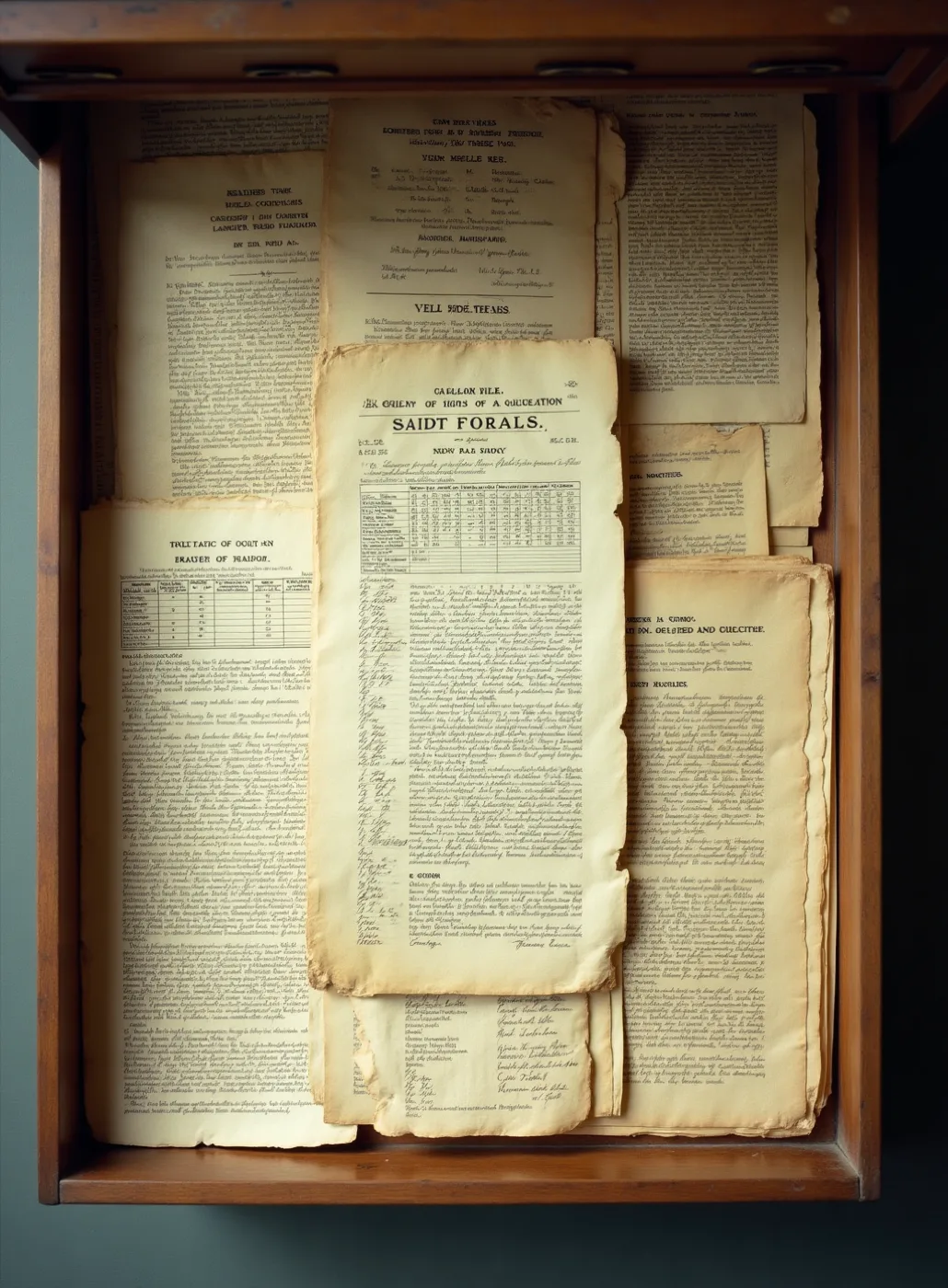
An open wooden drawer of old printed ephemera seen from directly above — bills, ruled tabulations and handwritten ledger sheets, foxed and torn, stacked loose

Market bills, tabulations and merchants' sheets: printed to be read once and thrown out, and better looking than most things made to last. That is what the whole suite borrows from — useful first, handsome by accident.
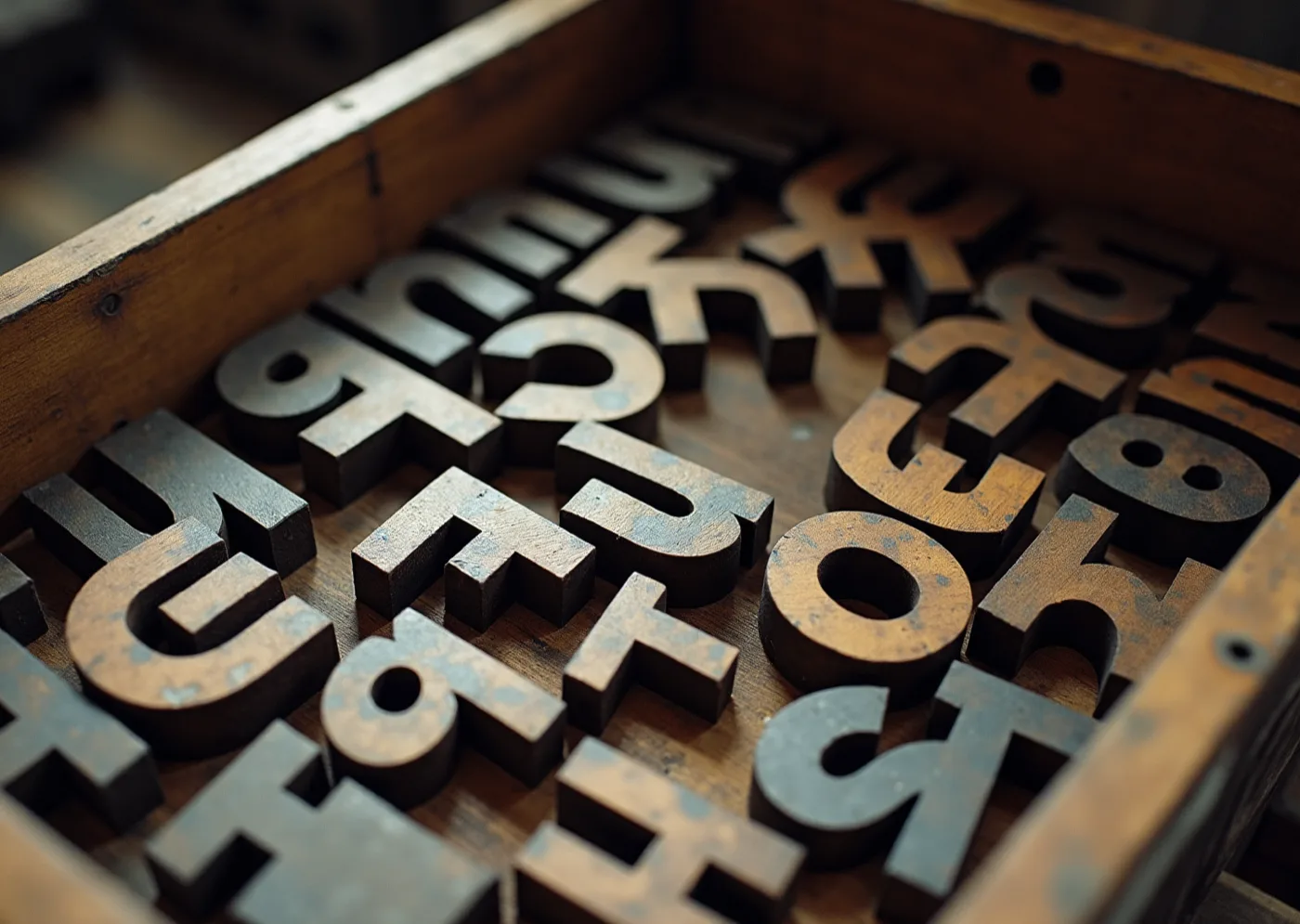
Loose wooden printing letters lying in an open wooden tray, face up and at angles, spelling nothing

Letters loose in the case, never spelling anything. What the restaurant owns is the kit, not any one sheet, so a new piece is a rearrangement rather than a new commission, for years.
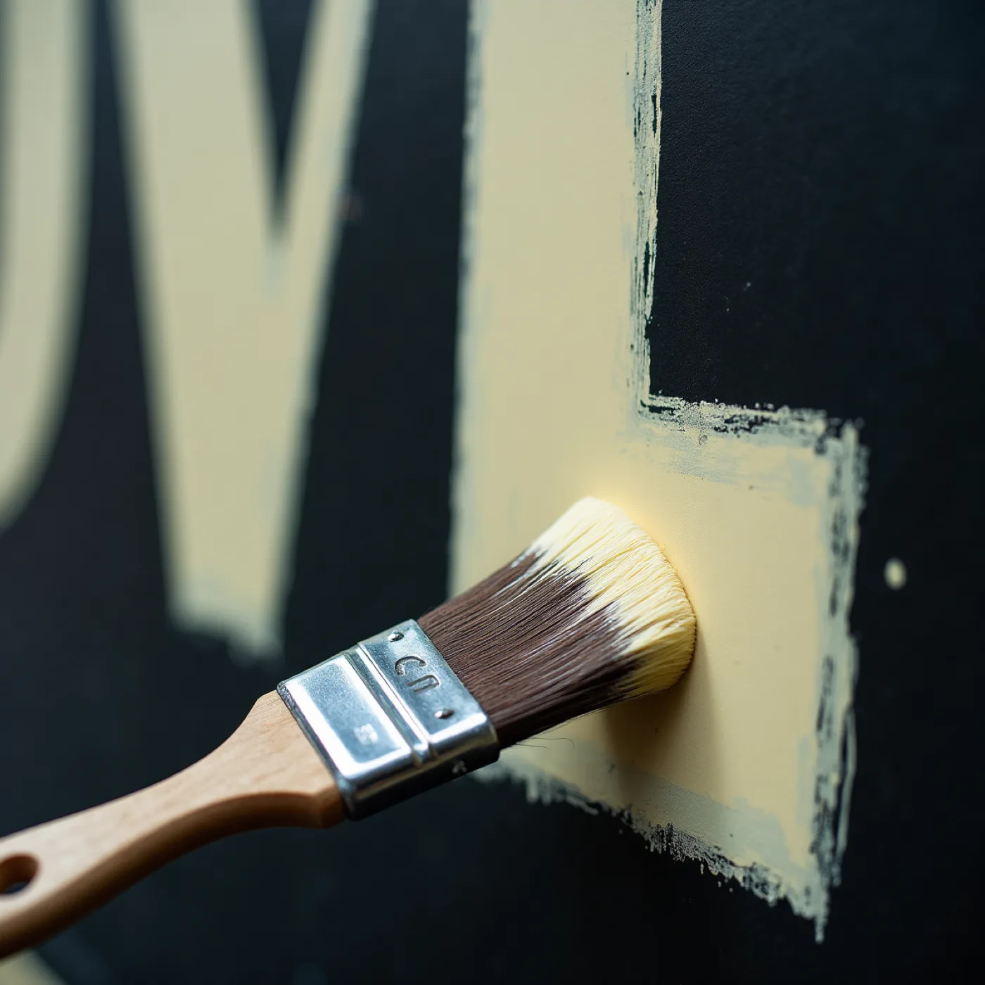
Close crop of a flat signwriter's brush laying pale enamel into the edge of one large letter on a black painted board, more letters out of focus behind

Made at the size it prints. The weight of a letter belongs to the board it is painted on, and nothing here is drawn small on a screen and scaled up afterwards.
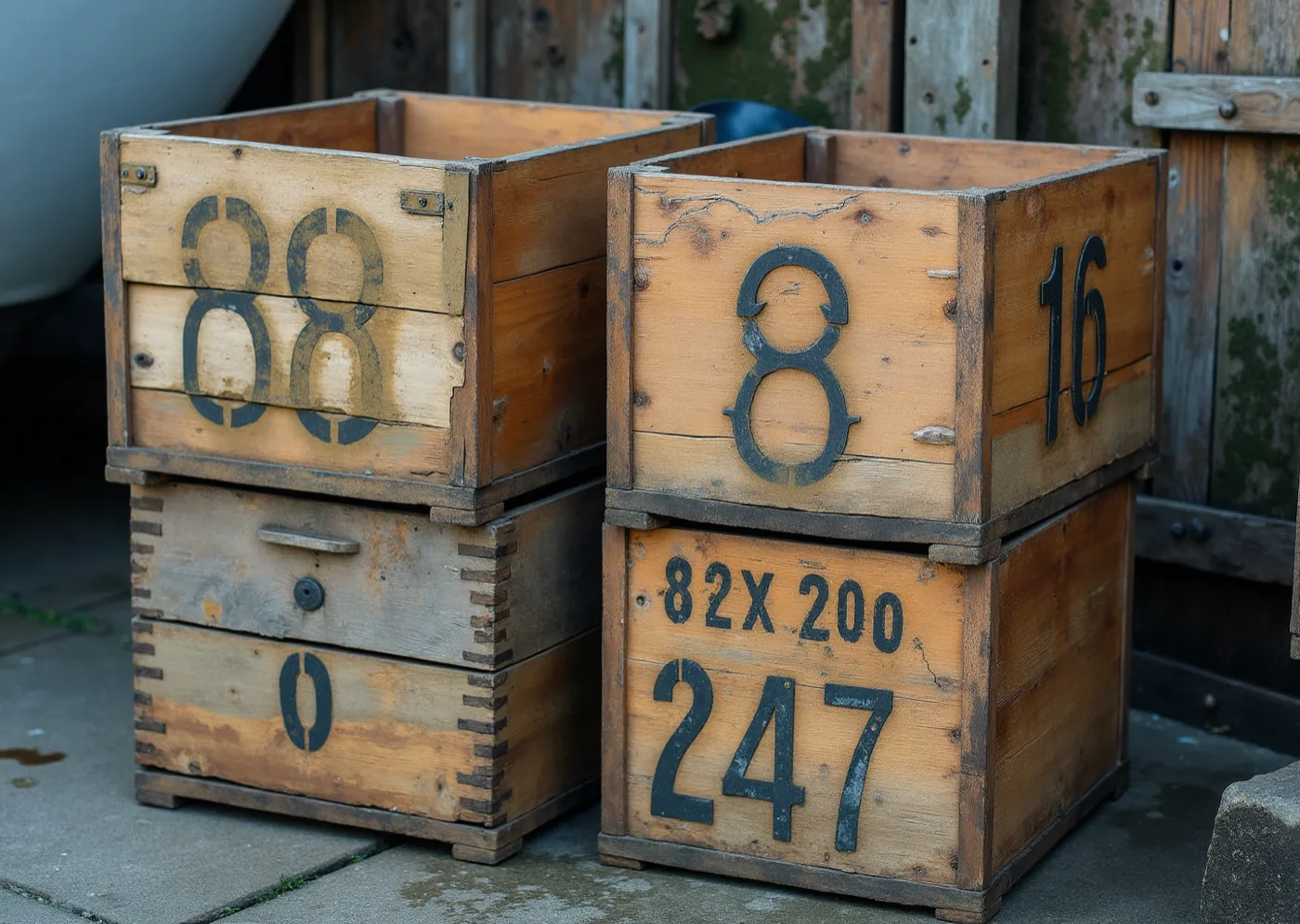
Two stacked wooden produce crates with black stencilled numerals, timber weathered pale and split, standing against a boarded fence

Lettering made for one job by people with no interest in lettering. This is where the plainness comes from — the crates, not a chalkboard. It is also the line this world has to keep walking, and your brief bans the other side of it by name.
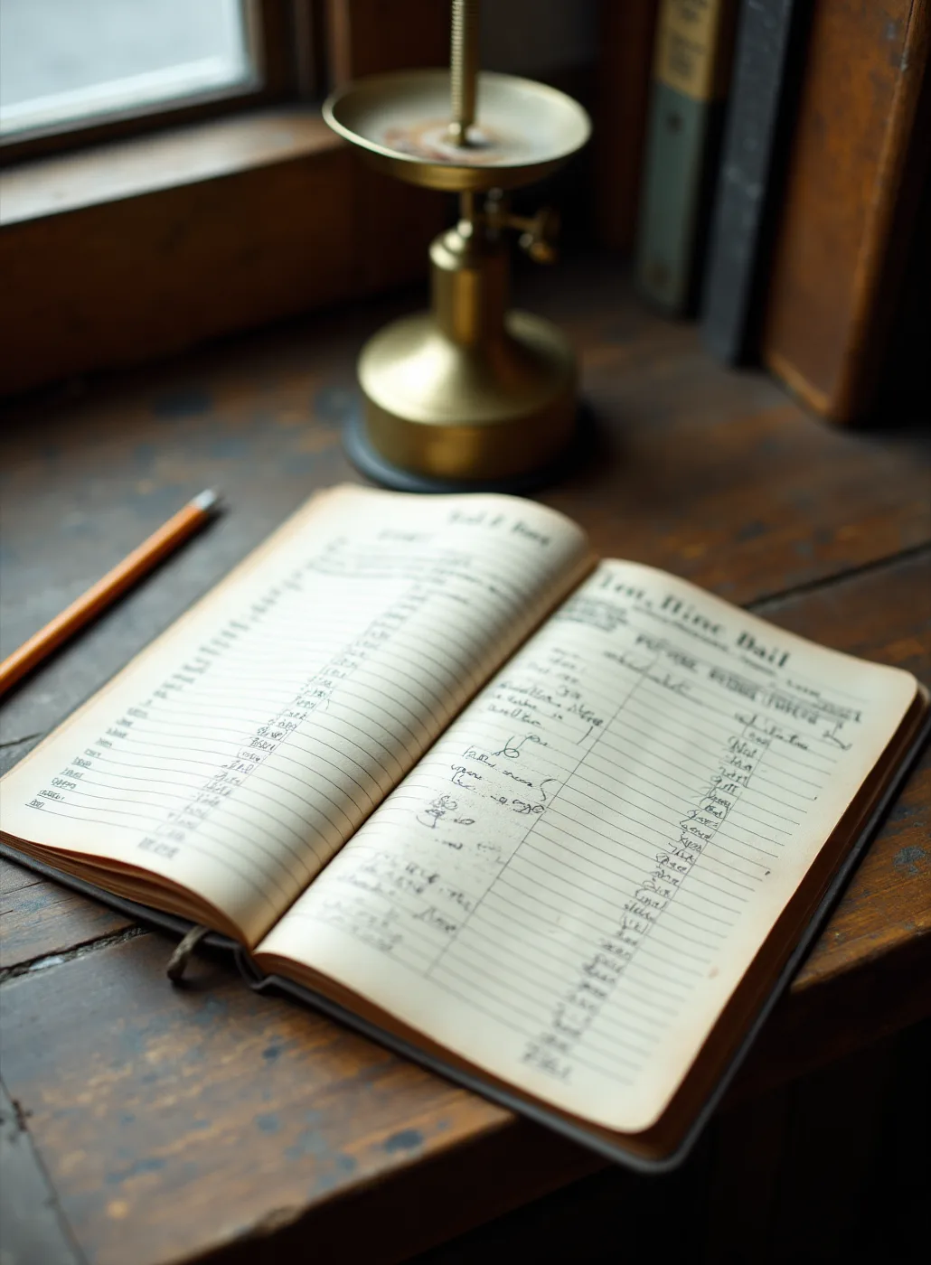
An open supplier's day book on a worn wooden table by a window, ruled columns filled in by hand, a brass scale and a pencil beside it

Your suppliers already write all of this down every morning. The invitation is that document made properly: ruled, listed, and specific about who brought what.
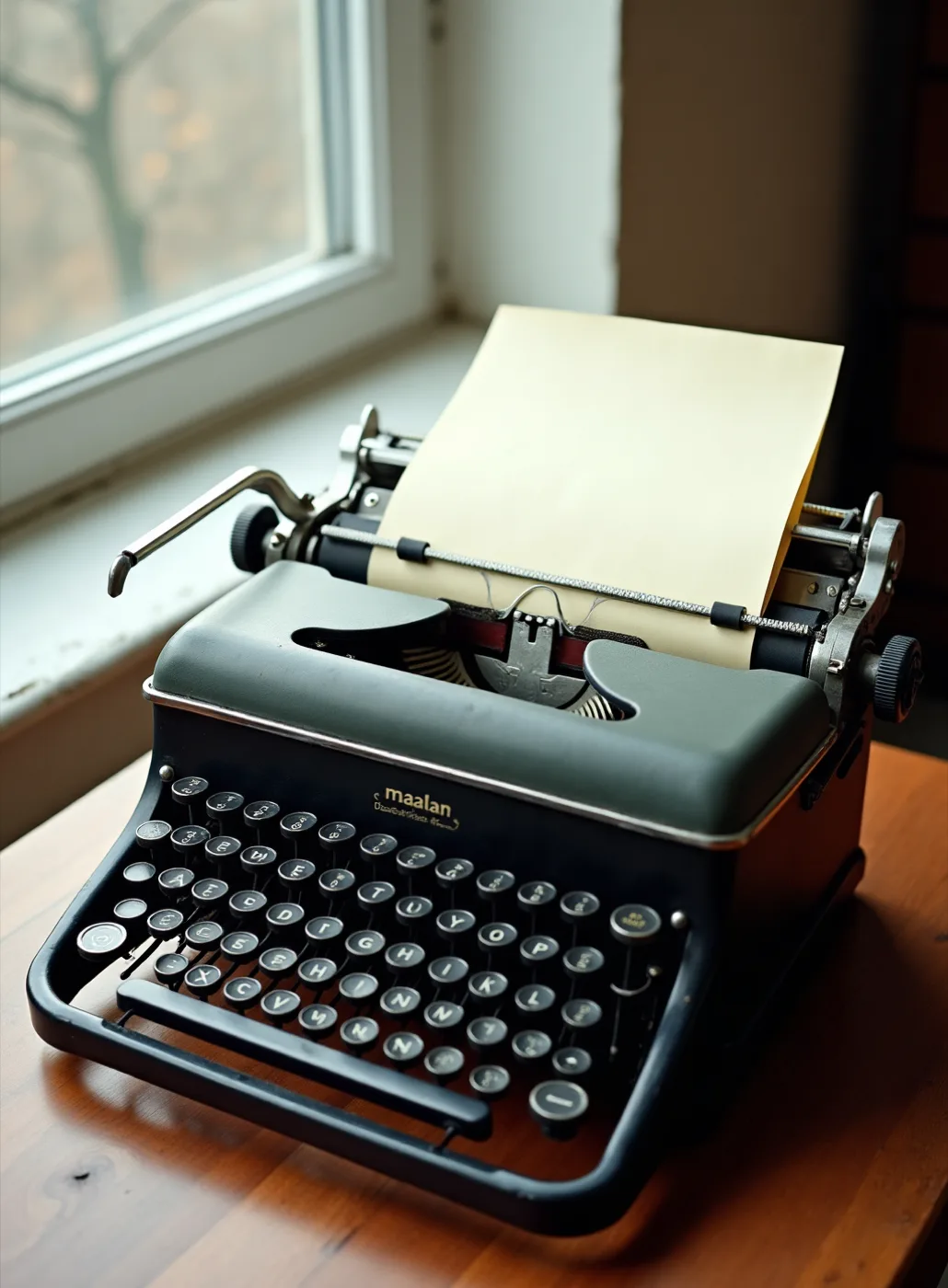
A sheet of cream typing paper hung on an iron hook against a whitewashed boarded wall, typed on a manual typewriter, in hard raking sunlight

The layer that changes with the tide should look cheap and be cheap. A day's list costs a keystroke and a sheet, so nothing that lasts is ever reprinted just to say what came in today.
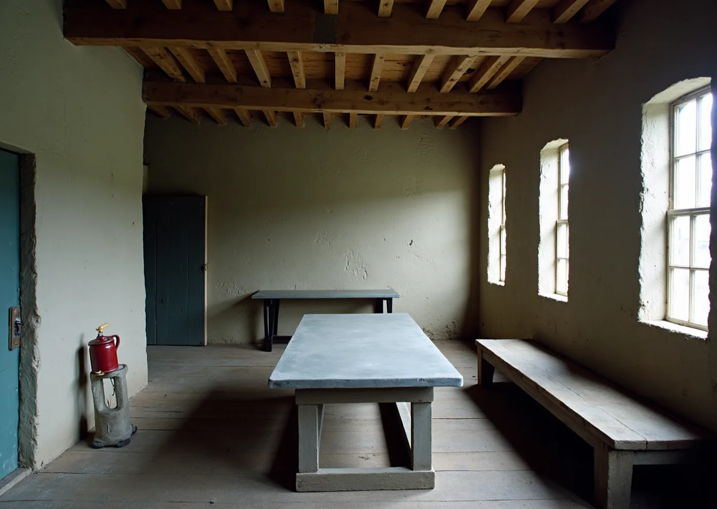
The inside of an old stone loft — lime-washed walls, bare timber joists, a plank floor, a zinc-topped table and a plain bench, lit by small deep-set windows

Your own room, before anything is hung on it. Lime, timber, deal and zinc are already this severe, and paper made only of words agrees with the walls instead of decorating them.
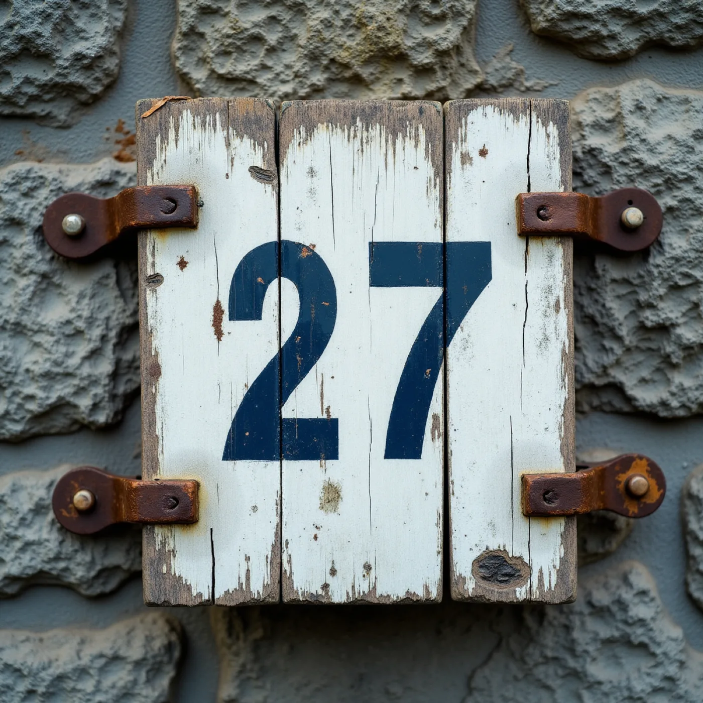
A painted timber board bolted to a rough stone wall with rusted iron straps, its white ground worn back to bare wood, two large painted numerals still legible

Painted to be read across a harbour, and what survives the weather is the number. Whatever is largest lasts longest — which is why size and position are the only hierarchy this world gets.

Bill paper#EADCBFGround
Signwriter's green#1F4033Ink
Poster orange#D4541BAccent
Slip grey#8E9088Working stock

The job, in numbers

Scope
Nine pieces · sixty covers · one evening
The invitation
99 × 240 mm · 540gsm bill board · two colours
The day's list
A5 · light sheet · reprinted whenever the boats change it
The welcome board
500 × 700 mm · enamel on primed timber, painted by hand
Artwork locks
30 April 2027 — the painted board first of all

Type specimen

MARRAM

display — Hanken Grotesk 800, set in one size only, tracked tight and printed flat at full strength.

OPENING DINNER · FRIDAY 21 MAY 2027

support — the same face at half the size, tracked open and ranged left, the way a bill states its second fact.

the net loft, commercial road, porthleven — seven in the evening, sixty covers

detail — the same family again at 400, lower case, generously leaded, because a long list read by candlelight wants an even colour and no character at all.

One family, worked from one end of its weight to the other: loud enough to be read from the quay, quiet enough to carry a wine list at a table. The contrast is scale and weight, not decoration, which is the only contrast a room this plain will take.

Materials & production

Warm uncoated stock at two weights, and the split is the idea: a heavy board around 540gsm for the invitation, place cards and table names, and a light, frankly cheap sheet for anything that changes — the daily list, the wine list — because a working document should look like one and should cost nothing to reprint. Letterpress where the lettering is the design, so the impression is the only ornament; flat litho where a piece is mostly words. Colour prints as flat areas at full strength rather than as tint, which is what lets a two-colour job read from the harbour wall. No foil, no varnish, no emboss. The welcome piece is painted rather than printed — signwriter's enamel on a primed board — which at 500 × 700mm is both cheaper than a print and the only piece in the suite genuinely made by a hand at full size. Two production cautions carried from the direction: a painted board cannot be re-proofed, so its layout locks earliest of all nine pieces; and heavy flat colour on cheap stock shows through, so the light sheet has to be tested double-sided before the daily list is committed to it.

What this world actually makes

Three objects, described rather than drawn: the paper you would be holding on 21 May, the sheet that gets reprinted whenever the boats change it, and the one piece painted by a hand at full size. Each is set in the type, colours and stocks named above.

The invitation · 99 × 240 mmBill board, letterpress, two colours. One face at three sizes, everything ranged left, and the only ornament is the impression. The rules in the right-hand column are printed empty on purpose: who brought the dory and the hogget is written in by hand once it is known, which is the difference between a bill and a brochure.
The day's list · A5The layer that changes with the tide, on the light sheet: one ink, no rules, no board. It costs a keystroke and a sheet, so the heavy pieces never have to be reprinted to say what came in today. This is the piece that does the work the photographs on this board are only describing.
The welcome board · 500 × 700 mmSignwriter's enamel on primed timber, painted at the size it is read at — cheaper than a print at this scale, and the only piece in the suite made by a hand rather than a press. It cannot be re-proofed, so its layout locks before anything printed.
Invitation

A bill for one dinner: what is coming, who is bringing it, where and when, ranged left, the largest thing read first.

Suite

Two stocks, and the split is the idea. Heavy board for what lasts; a light, frankly cheap sheet for anything that changes.

Signage & space

The welcome board is painted rather than printed — enamel on primed timber, the one piece a hand makes at full size. The six coast names are lettered the same way.

Digital

The same sheet with nothing to load. No image means it survives being screenshotted and forwarded, which is what actually happens to an invitation on a phone.

Guest arc

They read who caught it and who grew it before they sit down, and the table they are put at is a stretch of coast they already know.

Where Rinsey goes. In a world with no pictures the only way to honour your grandmother's garden is to say it: a table name, and a line of type naming where the asparagus came from. Plainer than a drawing, and it can name a person, which a drawing cannot.

Why there is no picture at all. You ruled out plated food and every nautical device. This takes the picture out entirely — nothing to date in a year, nothing to be misread as a seafood restaurant, and the words left carrying the room.

Still open in this world

Direction B · the world on the table

The Kitchen Table

The invitation is the morning’s ingredients laid out before anything is cooked: shell-cream paper, everything drawn by hand in ink and a loose wash, the courses typed underneath as plainly as you write them on the pass — because you do not write the menu until you have seen what came in.

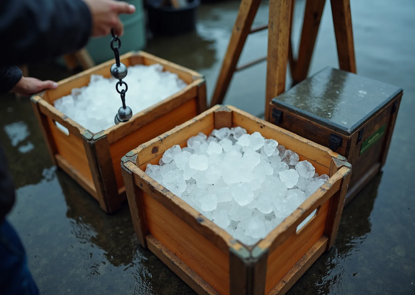
Early morning on a wet quay — two wooden crates packed with crushed ice, a hanging scale being lowered into one, hands cropped at the wrist, a trestle and a slate-topped chest behind

The half of the day the guests never see, and the half this world is made from. Ice, a scale and a wet floor: the subject is what arrives and gets weighed, and nothing in the crate has been made the hero yet.

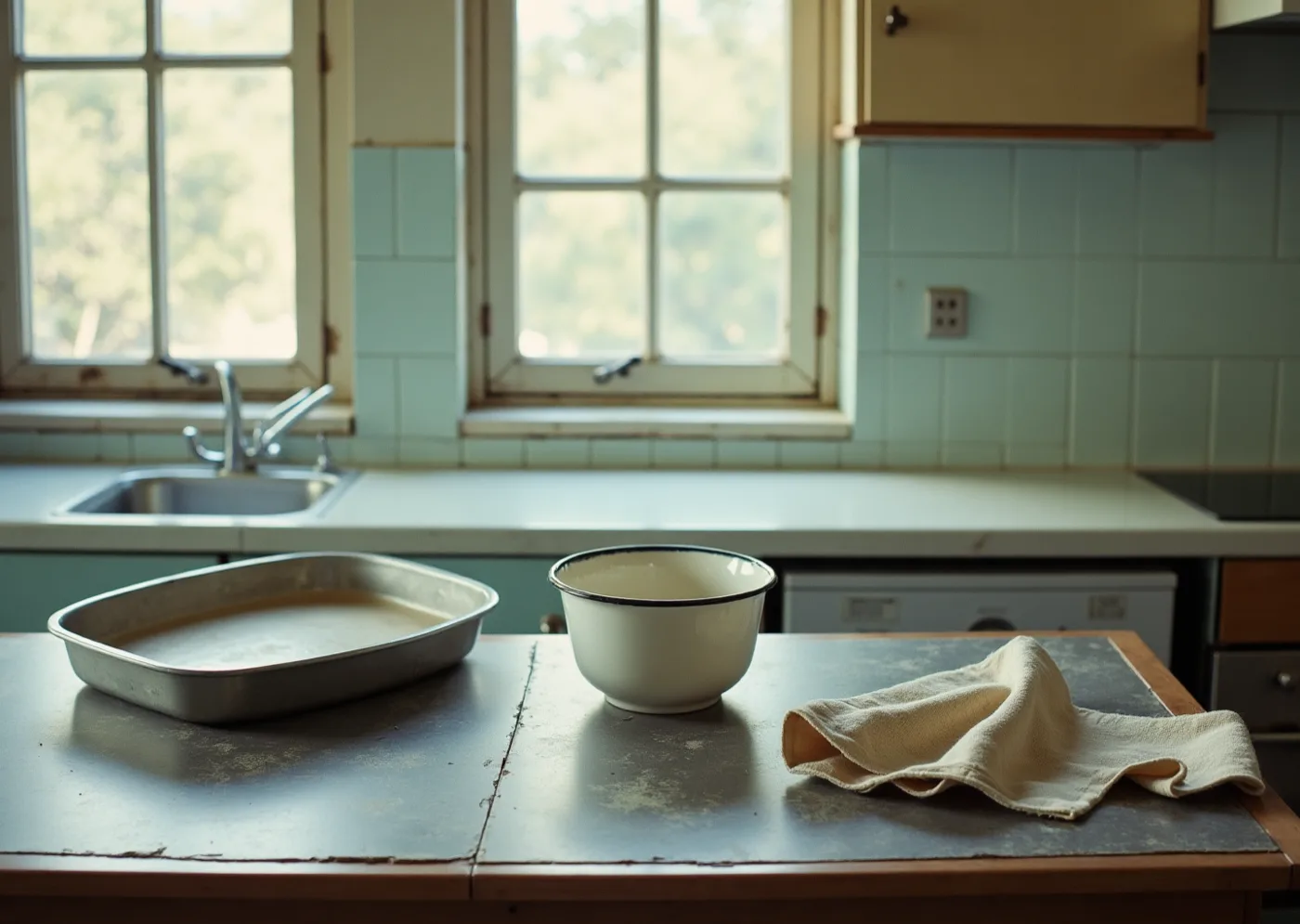
A worn zinc-topped table in the foreground of a plain pale kitchen, an enamel bowl, a metal tray and a linen cloth set on it, tall sash windows behind

The surface everything is put down on before anyone decides what it becomes. It is here for the wear, not the colour — a working top, scrubbed thin, that has never once been styled.

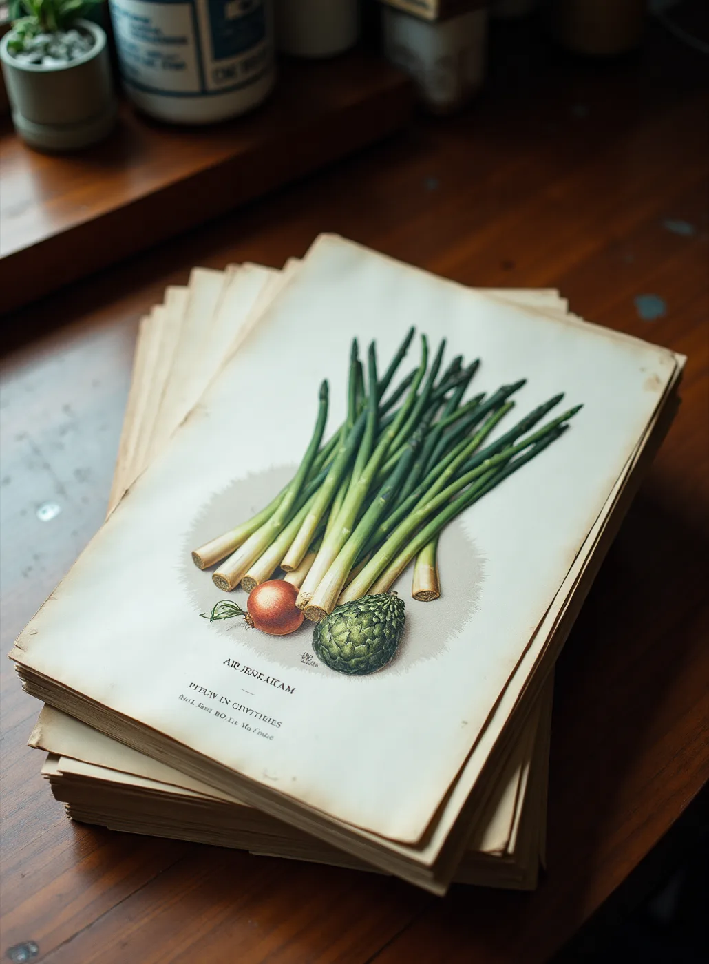
A loose stack of old seed-merchants' catalogue plates on a dark wooden counter, the top sheet a colour lithograph of vegetables printed on absorbent paper

A nurseryman's catalogue plate: flat separated colour on paper that drinks it, made to be useful rather than admired. It argues for a lineage, English horticultural print, without yet proposing anything to draw.

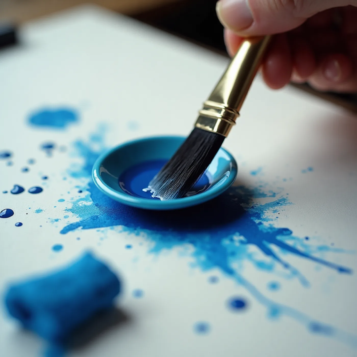
Close crop of a hand loading a pointed brush with blue ink from a small saucer, splashes and drops scattered across the sheet beneath

Hand-made is a property of the process, and the instrument is deliberately still open — a pen, a cut block, a stencil and a press are all live. This is the act, not the answer, and the choice moves the press, the sheet and the cost.

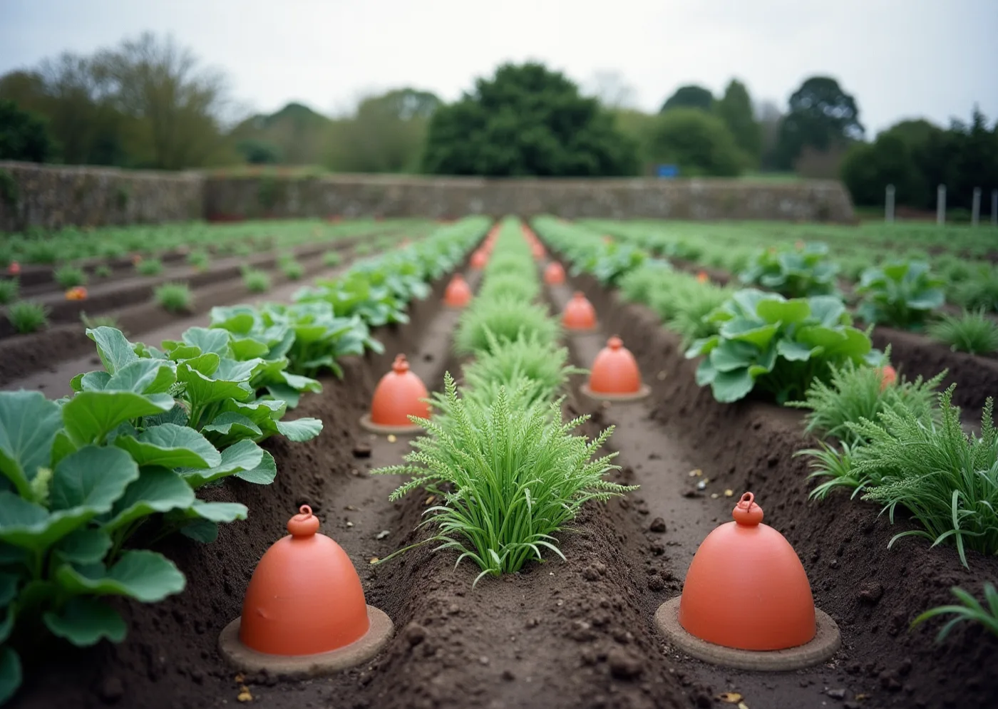
A Cornish market garden in May seen along ridged rows — terracotta forcing pots, brassica leaves, feathery fern and wet earth, a granite hedge bank behind

Rinsey ground in the week you open. The colour comes off here, and so does the abundance a hard-surfaced room does not have on its own.

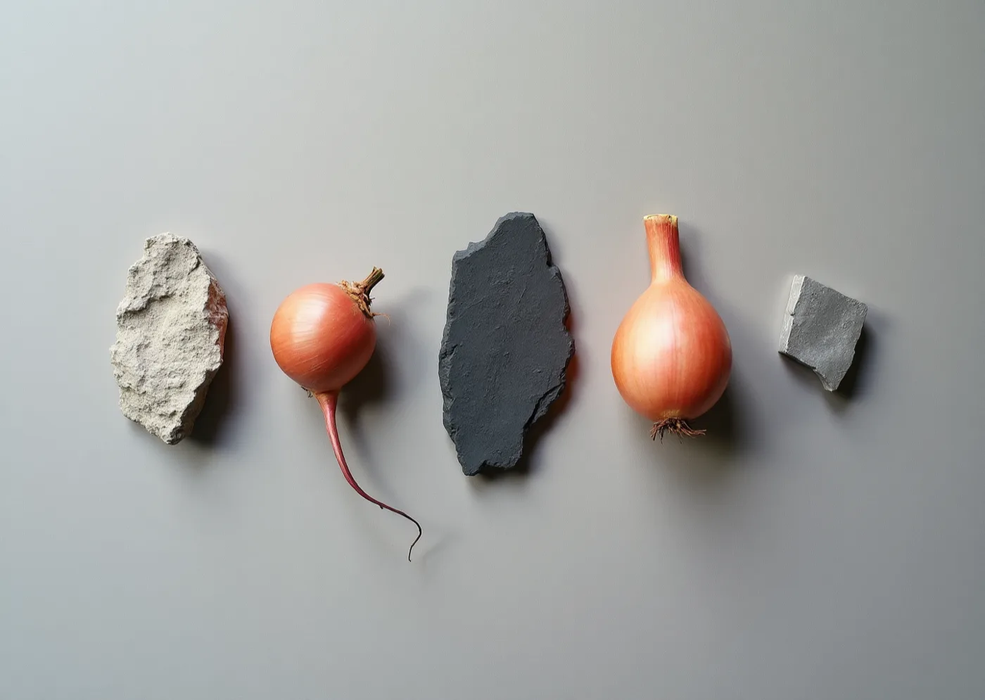
Five things laid in a row on grey — a piece of pale granite, an onion with its root, a shard of slate, a second onion and a small block of concrete — photographed from above, unlabelled

Colour taken off things you actually handle, laid out with nothing named. Each one still has to earn a role, and a plain verdict on whether it may carry type at all.

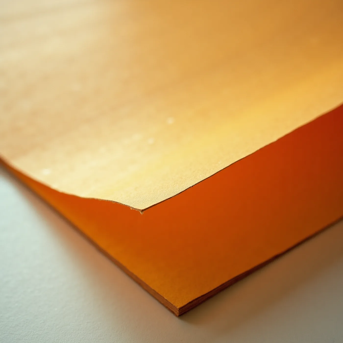
Raking-light macro of a warm uncoated sheet with a heavy tooth and a torn edge, lying on a second sheet, no ink on it

A sheet that takes ink slightly unevenly is an asset here, not a fault. The material gets approved in the hand, before anything at all is designed onto it.

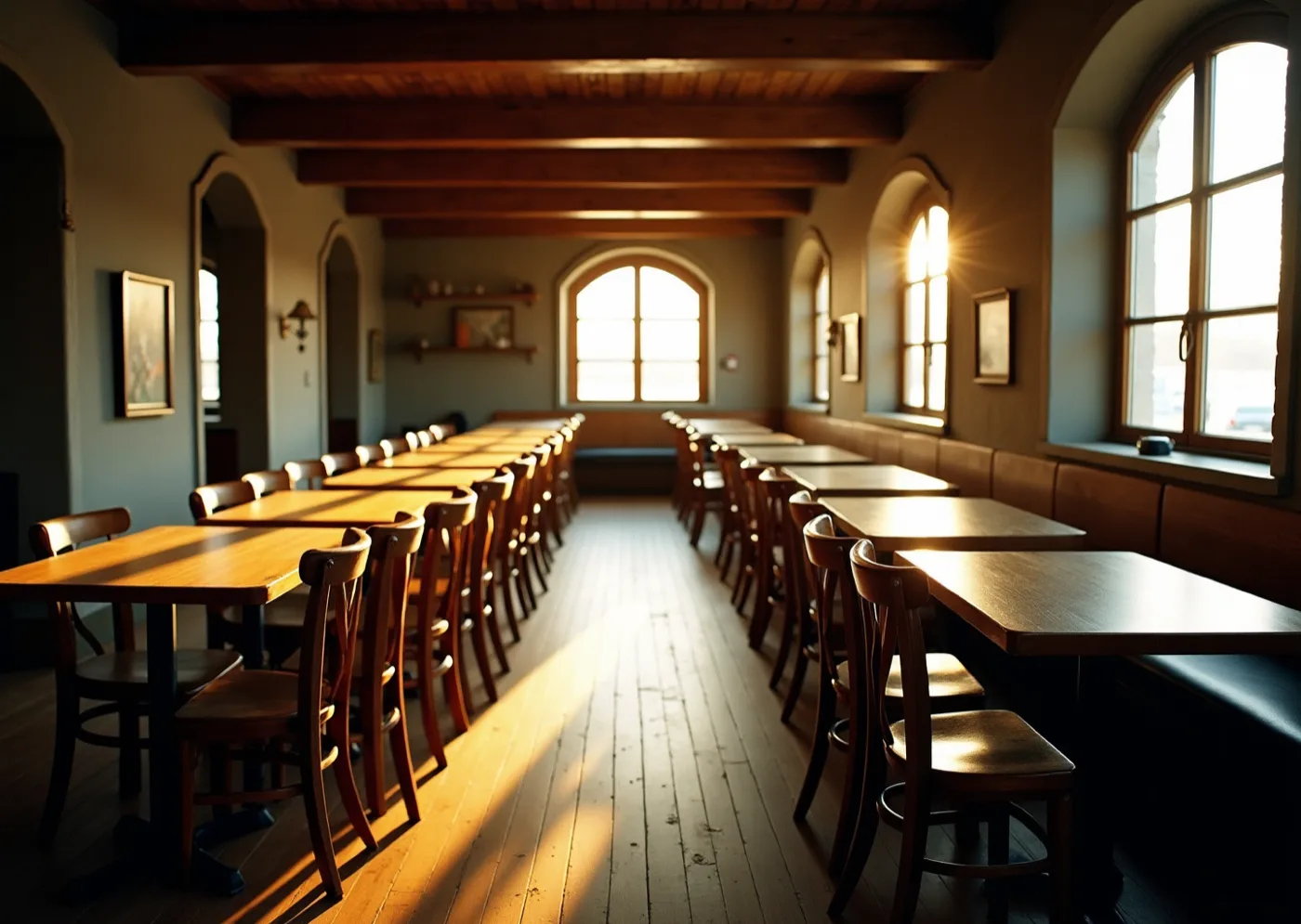
A long dining room at seven on a late-May evening — bare wooden tables and bentwood chairs in two rows, a plank floor, arched windows down one side, low sun flaring through, empty before service

Your room at seven on a late-May evening: the dinner starts in broad daylight and finishes by candle. Everything has to hold in both, which makes it a type and colour decision rather than a mood.

Type specimen

Menu

display — Pinyon Script, the course headings and nothing else

porthleven crab, asparagus and brown butter

body — IBM Plex Mono, 400, lower case, always

the net loft, commercial road — seven in the evening

detail — IBM Plex Mono, 300

A written hand for the four words that repeat, and a typewriter for everything that changes with the season. Two families, no more.

Shell cream#F6EDE3Ground
Mackerel blue#3D6B99Ink
Garden olive#3D4A2CDisplay
Chilli brick#8E3B2CIn the imagery
Shell-cream uncoated board, 540gsm, deckled — litho in full colour so the wash keeps its edges.

The drawings

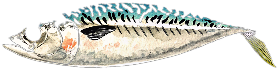
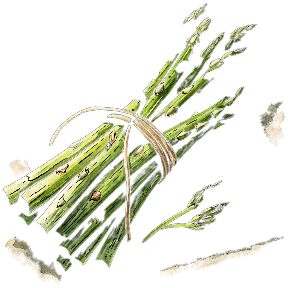
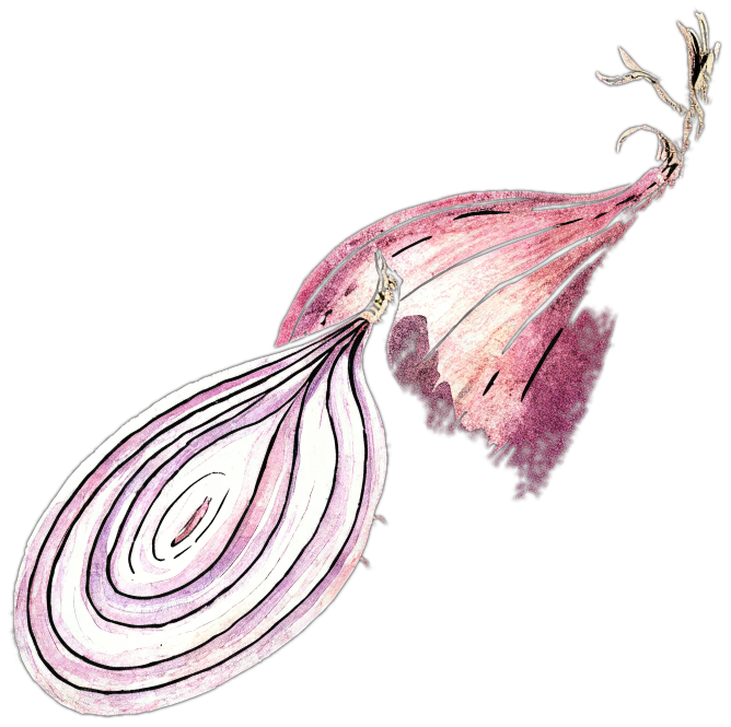
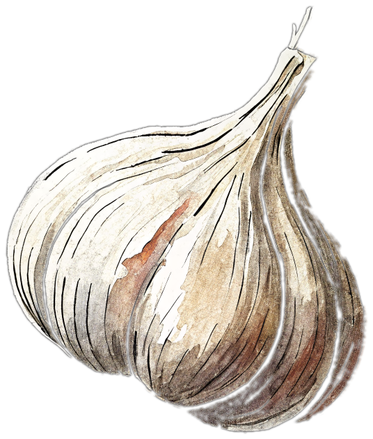
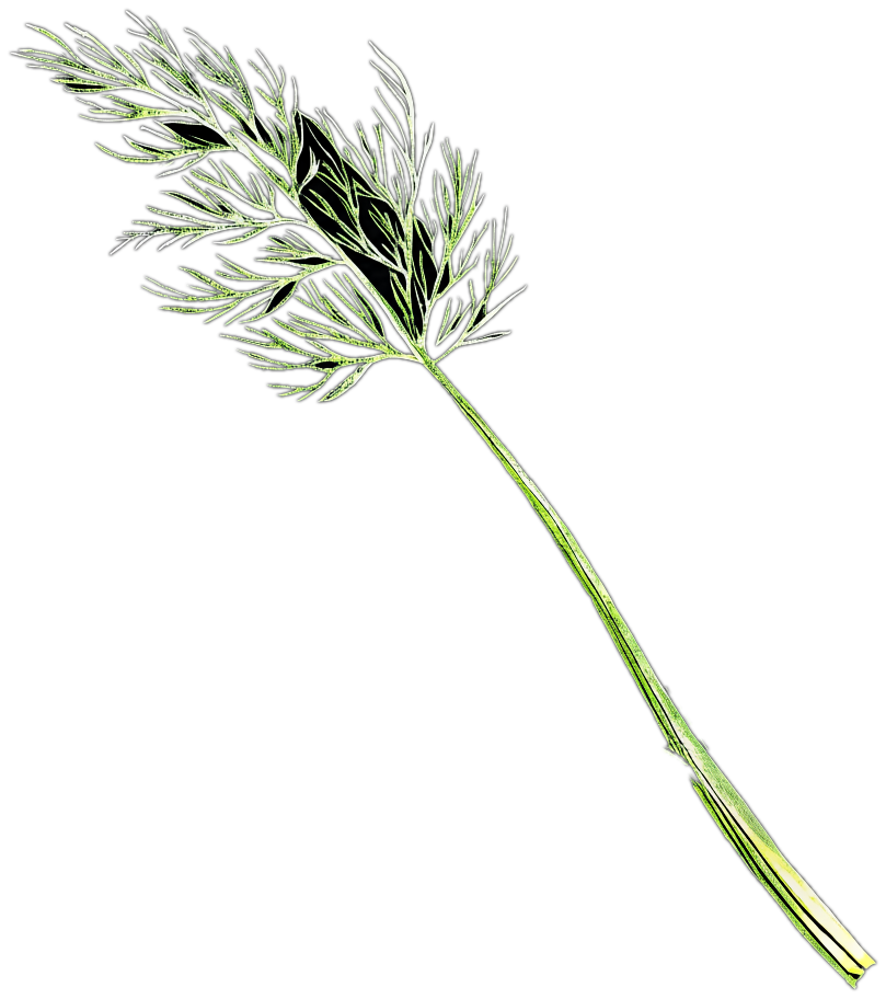
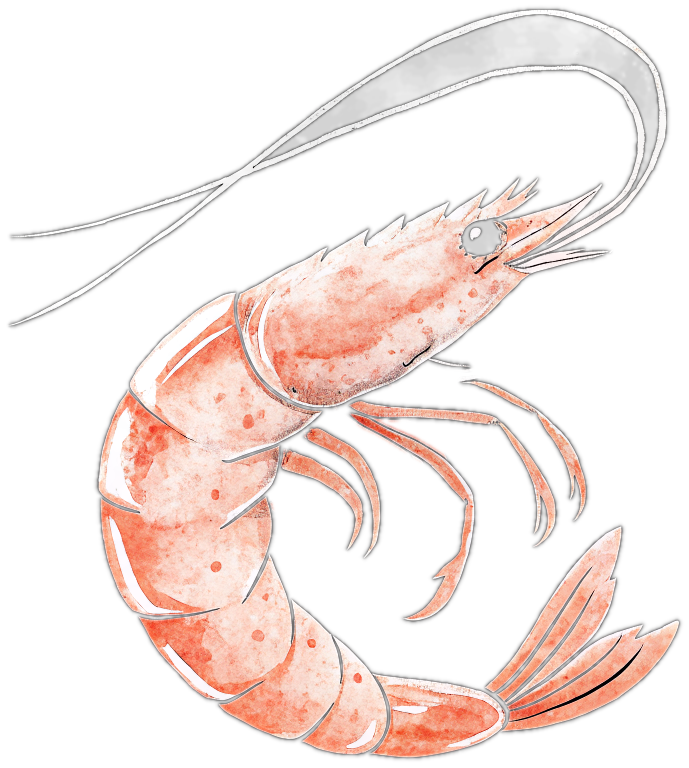
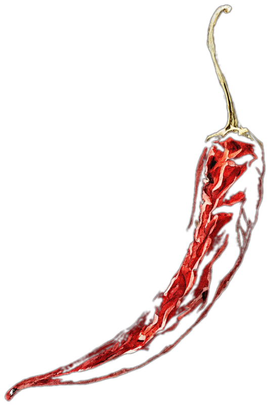
This world claims to be drawn rather than photographed, so here are the drawings themselves — ink and a loose wash, the raw ingredient and never the finished dish, seated on the shell-cream stock they print on. The menu is made of nothing but this group, four written headings and the dishes typed underneath.

The menu card · 99 × 240 mmThe piece you said matters most, at its real size: the whole drawn group once at the head, four course headings in the written hand, and the dishes typed underneath in lower case exactly as they go on the pass. Every other piece takes one or two of the drawings and never the whole cast twice.
Hand-drawn whole mackerel in blue ink and washMackerel · the fish leads
Hand-drawn bundle of asparagusAsparagus · Rinsey
Hand-drawn onion halved to show its ringsOnion · cut for the rings
Hand-drawn garlic bulbGarlic
Hand-drawn dill frondDill
Hand-drawn prawnPrawn
Hand-drawn dried chilliChilli · the one hot red

The pepper mill is out — you asked for it, and it has gone from every piece. It was the one object here that was not a raw ingredient, it was cut off flat at its foot where its drawing stopped, and it read black against a group of washes. The loose peppercorns went with it: they were its spill, and without the mill they were specks on the paper rather than drawn marks. The seven above are now the whole cast. One thing is still not finished: the mackerel's head is malformed in the current drawing — no eye, and the gill and jaw break up — and it is the largest thing on every surface it appears on, so it has to be redrawn before anything is printed.

Invitation

The same drawn group, smaller, with the date typed beneath it.

Suite

Each piece takes one or two ingredients from the group — never the whole cast twice.

Signage & space

Table names typed on cream card; the drawing appears once, at the door.

Digital

Cream field, one drawing, typed lines. No motion, no gloss.

Guest arc

They read the ingredients before they taste them — the card is the morning, the plate is the evening.

The asparagus is not decoration. You open the week it is at its best, and it is what your grandmother grew most of at Rinsey. It is in the drawing on every piece that has room for it.

Why a whole fish and not a dish. Your brief bans photographs of plated food, and this is the same instinct followed further: the raw ingredient is honest about the kitchen, a finished plate is a claim about the chef.

The choice

What the choice turned on

One says it in words; one draws it. They cannot be combined — a sheet whose whole argument is that it carries no picture, and a sheet built around a drawn still-life, want opposite things, and splitting the difference is what makes paper look like a brochure.

A — Written Up

You want the paper to be the record: bill-paper stock, no picture anywhere, one family of type worked from a name you can read across a harbour down to a wine list at a table. It names the boat and the grower instead of showing them.

B — The Kitchen TableBUILT

You want the paper to be the morning: shell cream, the raw ingredients drawn by hand in ink and wash, the courses typed underneath in lower case exactly as you write them on the pass.

 A · Written UpB · The Kitchen Table
Where the image comes fromNowhere — there is no image.A pen, at the table.
GroundBill paper, warm and flat.Shell cream, warm.
The inkSignwriter's green, and one poster orange.Mackerel blue — never black.
TypeOne grotesk, 800 down to 400.A written hand over a typewriter.
What repeatsThe list, and size as the only hierarchy.One or two ingredients per piece.
TemperaturePlain, direct, unsentimental.Morning, warm, generous.
Cost shapeLetterpress, plus one board painted by hand.Full-colour litho; the craft is in the drawings.

Direction B — The Kitchen Table — is the world that was built. Every piece in the suite descends from it; Written Up was not carried forward.

See the finished suite →