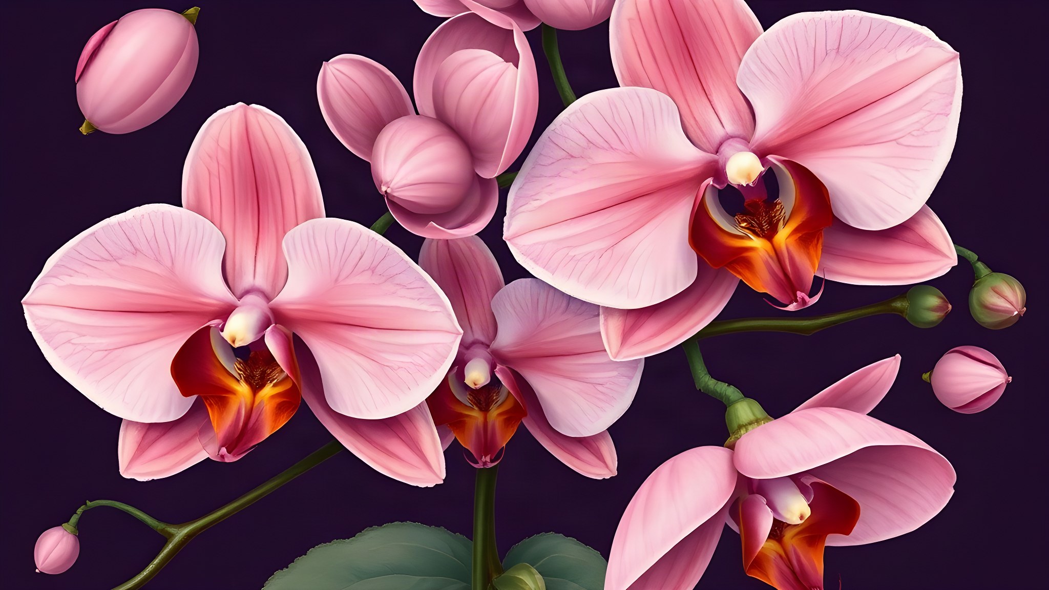
A Redouté botanical plate, displaced to a warm Miami midnight, with an inherited garnet set into the centre of every piece. Two worlds hold it: one tender, one proud.
The brief did not describe a party. It described a girl with a specific eye and a specific inheritance — a venue she chose at thirteen on a school trip and never let go of, a grandmother in the front row, and a pair of earrings that have crossed a sea and sixty years to be worn for the first time that night.
Both worlds below were built in full from that brief. They begin in exactly the same place. They simply arrive differently.
Direction A holds that feeling tenderly. Direction B holds it proudly.The only real difference between the two worlds
“Abuela Carmen’s pearl and garnet earrings — brought from Havana in 1980. Gabriella will wear them for the first time at this party. She has been asking to wear them since she was five.”From the briefing · held as the standard for every design decision
dusty mauve · botanical at night · Redouté precision · Tim Walker depth · Havana to Miami · Vizcaya stone · Mola geometry · bilingual without hierarchy · garnet & pearl · nothing generic
Gabriella
Gabriella Sofia Torres · Sweet Sixteen
Saturday, the Nineteenth of December · Two Thousand & Twenty-Six
The suite’s type scale. Point sizes are the printed sizes; shown here reduced to fit the page.
Luminous inheritance — scientific beauty made emotional, and something hidden for the person who looks twice.
Redouté’s botanical precision — but at night. Deep midnight grounds a luminous arrangement of orchids, moonflowers and gardenias in the exact palette: blush petals catching invisible light, orchid pigment at the heart, gold stamens catching the lantern glow from the water.
At the centre of every piece, almost hidden among the petals, a single garnet and pearl jewel — Abuela Carmen’s earring, in its rightful place. Not a graphic element. An inheritance. The suite is soft, layered, deeply feminine — something that rewards looking closely, exactly as Diana Vreeland asked.

“A guest opens this and does not think ‘Sweet Sixteen’. They think someone painted this. Then they look again, find the garnet, and understand it was never decoration — it was the point.”
What we will never do — the brief was explicitThe material, as delivered
Quoted from this suite's own production spec — the stock the invitation was actually printed on. Surfaces are rendered from that spec, not photographed.
Baroque, tide and heritage — the venue she chose at thirteen, and the textile tradition of her Colombian side.
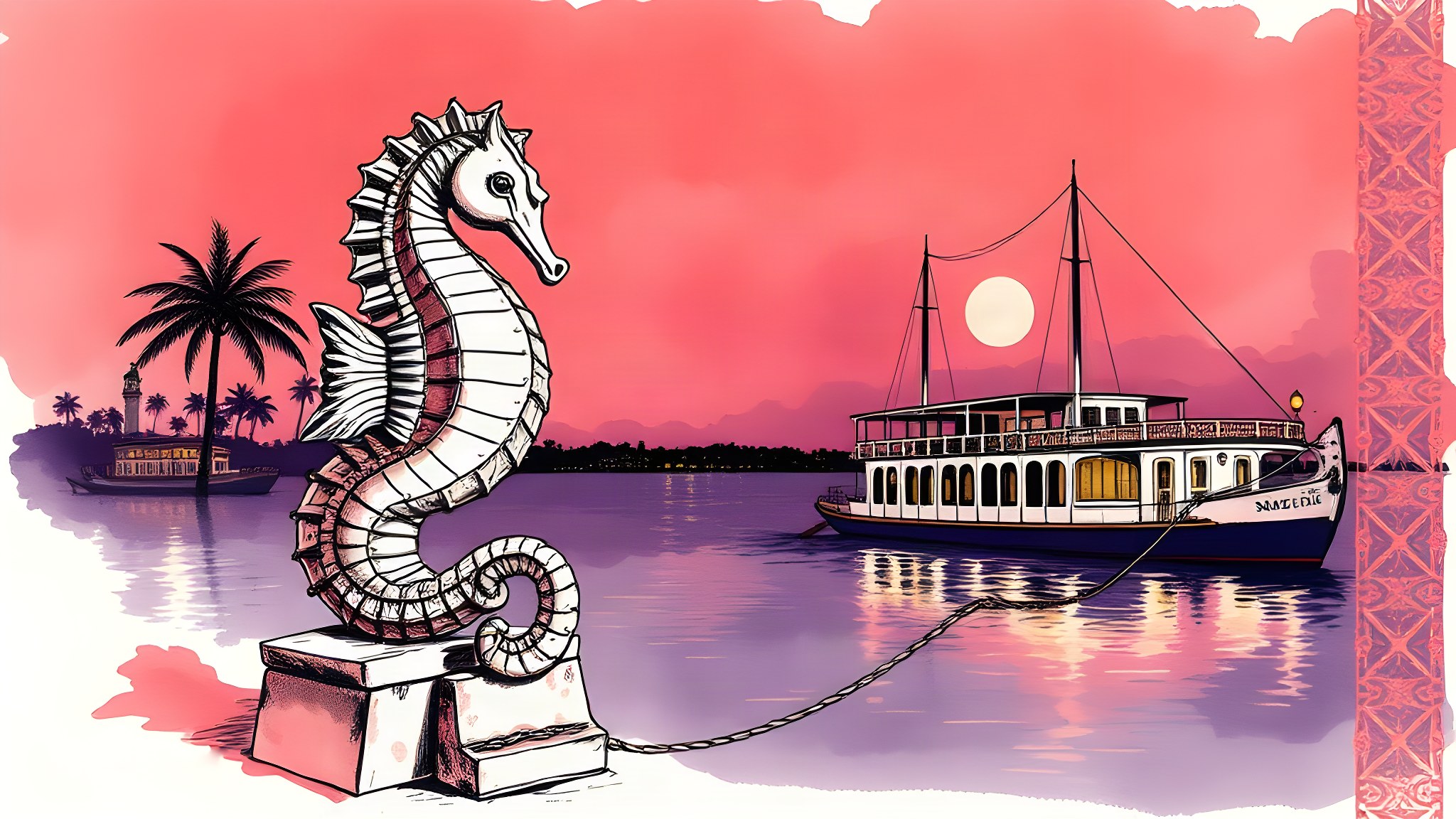
Vizcaya’s Barge is made of stone — carved seahorses, grotesque ornament, classical balustrades rising from dark water. This direction takes that architecture and renders it in loose ink on garnet watercolour tides. Bold. Dramatic. Rooted in the place Gabriella chose because she came here at thirteen and decided: this is where I turn sixteen.
The border patterns are drawn from Mola — the geometric textile tradition from Colombia and Panama that lives in Gabriella’s family heritage. Gold geometric inlay meets Baroque stone meets dark bay water at midnight. Warm and proud, not soft and apologetic.

“A guest opens this and knows immediately whose party it is. It is not a soft invitation. It is warm, loud and certain — the way she is when she talks about Vizcaya.”
What we will never do — the brief was explicit
A · Nocturnal Botanical
B · Stone & Marea
Design decisions without reasons are just preferences. Here is the briefing line behind each major choice, and what we did with it.
“The garnet colour (deep red-plum) should appear as an accent somewhere.”
The earrings are the emotional centre of this event. The colour of the garnet is not an accent — it is an inheritance made visible on the page. We added it as a fifth swatch so it is named and intentional, not incidental.
“Typography: Cormorant Garamond” · “The eye has to travel.”
Cormorant has extraordinary optical personality at display sizes — the contrast between hairline and body stroke creates movement. Diana Vreeland’s instruction and Gabriella’s own references both pointed to this face used boldly, not timidly.
“The floral illustration tradition of Pierre-Joseph Redouté, but at night, in Miami, with a Cuban grandmother in the front row.”
That instruction is almost a design brief in itself. The client told us exactly what the reference is and exactly how to displace it from its usual context. We took it literally.
“The embroidery tradition of Mola art from San Blas, Panama — on her Colombian side.”
This appeared in the story section of the brief, not the aesthetic section — which means it matters personally, not decoratively. Using it in Direction B lets the suite speak to that heritage without explaining it.
“She chose Vizcaya because she came here for a school trip in eighth grade and decided then that this was where she wanted to turn sixteen.”
The venue was chosen deliberately, years before the event. Carrying its architectural iconography — the carved stone seahorses that define the Barge — honours that decision rather than treating the venue as a backdrop.
“Material language: English, Español” · “Gabriella’s grand entrance song: ‘La Vida Es Un Carnaval’ by Celia Cruz.”
The cultural register of this family is bilingual — not half-English and half-Spanish, but fluently both. The suite gives equal visual respect to each, with neither set as a translation of the other.
“No generic Sweet 16 aesthetics. Nothing that could belong at anyone else’s party.”
Non-negotiable, and it shapes every visual decision on this page. Gabriella has a specific aesthetic and specific references. The design has to earn its place in that vocabulary — or it fails.
“Gabriella designed a monogram herself — a G and T intertwined that she sketched in her notebook. She would love it to be refined by your designers.”
A monogram the client drew and a designer refined is a different object from one invented from scratch — it carries authorship on both sides. We asked to see the original sketch so the refinement honours her intention.
“Vizcaya at night in December is already a painting — stone and moonlight and the bay.”
Miami in December is warm. The midnight here (#2A1A3A) carries purple warmth rather than cold blue — the midnight of a warm bay evening, not a northern winter. The blush and orchid are skin-temperature tones; the gold is lantern light, not chandelier cool.
Nocturnal Botanical was chosen. Six pieces hide a garnet jewel among the petals.
See the finished suiteThe Garnet Thread
A Redouté botanical plate displaced to a warm Miami midnight — scientific precision turned emotional, with an inheritance set into the centre of every piece.
Soft authority. Romantic as the brief asks, but with the composure of a fashion house — the eye has to travel before it finds the thing that matters.
Every piece carries the garnet (#8B1A2E) — Abuela Carmen’s earring colour. Not dominant, not decorative. Present, the way jewellery is present on someone who matters to you.
English and Español live together without hierarchy. Abuela Carmen’s toast in Spanish needs no translation printed beside it in the programme.
The G·T monogram is Gabriella’s sketchbook design, refined — used on all six pieces. Her drawing, elevated. One of the most personal things a house can do for a client.
No tiaras, no balloon fonts, no photobooth props. If a piece could belong at anyone else’s Sweet Sixteen, it is wrong and it does not ship.
The choice
Both worlds start in the same place — Vizcaya, Havana, and a pair of earrings crossing sixty years. They arrive differently: one holds that feeling tenderly, the other proudly.
Redouté’s botanical precision, but at night — orchids, moonflowers and gardenias on deep midnight, with Abuela Carmen’s garnet-and-pearl earring almost hidden at the centre of every piece. Not a graphic element; an inheritance.
The venue she chose at thirteen, rendered as itself — Vizcaya’s carved stone barge in loose ink over garnet watercolour tides, joined to the textile tradition of her Colombian side. Bold, dramatic, rooted.
| A · Nocturnal Botanical | B · Stone & Marea | |
|---|---|---|
| The subject | The flowers, painted at night. | The stone, and the water it rises from. |
| Technique | Botanical plate — precise, layered, close. | Loose ink over watercolour tide — gestural, large. |
| Where the inheritance sits | Half-hidden among the petals, found on the second look. | In the textile geometry, carried across the surface. |
| Temperature | Soft, layered, deeply feminine. | Baroque, bold, declarative. |
| The rest of the suite | Thinned to a single stem so the invitation stays loudest. | The architecture recurs at every scale. |
| What a guest thinks | “Someone painted this” — then finds the garnet. | “This is her building, and her sea.” |
The Torres family chose A — the suite was built from it.